UX Solutions
Process & experience
First of all, we did research spending several hours with the client discussing the main problems, his expectations and the biggest problems he struggled with. My experience in event organization helped me understand and forecast the structure and potential pain-points from the very beginning. I had a basic vision of potential requirements for the project and knew the right questions to ask the respondent to get more details. It was quite difficult to get access to real clients of my client so I asked about his vision regarding issues that his customers face. Of course, this way was definitely not the ideal one, but we had at least some minimal information required.
After the concept was somewhat clear, the first prototype of the website was built (in Axure RP). As long as my client was the main user for the system, I tried to test my ideas on him as often as possible - even every two-three days. He was motivated to provide me direct feedback. Those iterations saved us a lot of time by avoiding unnecessary changes, gave new ideas for possible new features to add and brought new requirements to the project. To simulate testing of my client's clients I recruited my colleagues (students) from the university. They were intelligent, well educated and similar to the doctoral students, who submit their papers for the conference.
When the satisfied version of the prototype was ready and tested, the implementation phase started. During that time intensive discussions with the team brought us new ideas and features, so the main concept had to be updated, tested again and again. Actually, we intuitively used a classical Design Thinking approach without knowing about it.
The Registration Page was a regular conference webpage but with a third-company plug-in for payment procedure.
Backend for Experts was just a simplified version of Backend for Administrators".
Thus, we will skip the description for those two mentioned above.
The Backend for Administrators Page
In general, this section was oriented on the client. We expected a lot of text information with controls in it. Also we knew that a Windows Desktop-PC with a HD-resolution monitor will be used (by a not-advanced PC customer). In the worst case - the Windows laptop.
Consequently we designed those pages for the default minimal 1366 x 768 px screen resolution and 1920 x 1080 px (as an ordinary one).
Also we refused to make pages responsive.
Of course we understood that our system will not be absolutely user-friendly, but the speed and cost of development was set as a high priority.
The Backend for Administrators Page was a control panel for the whole conference.
-
It consisted of 5 pages:
- Login Page
- Abstracts Page
- Session Topics Page
- Speakers Page
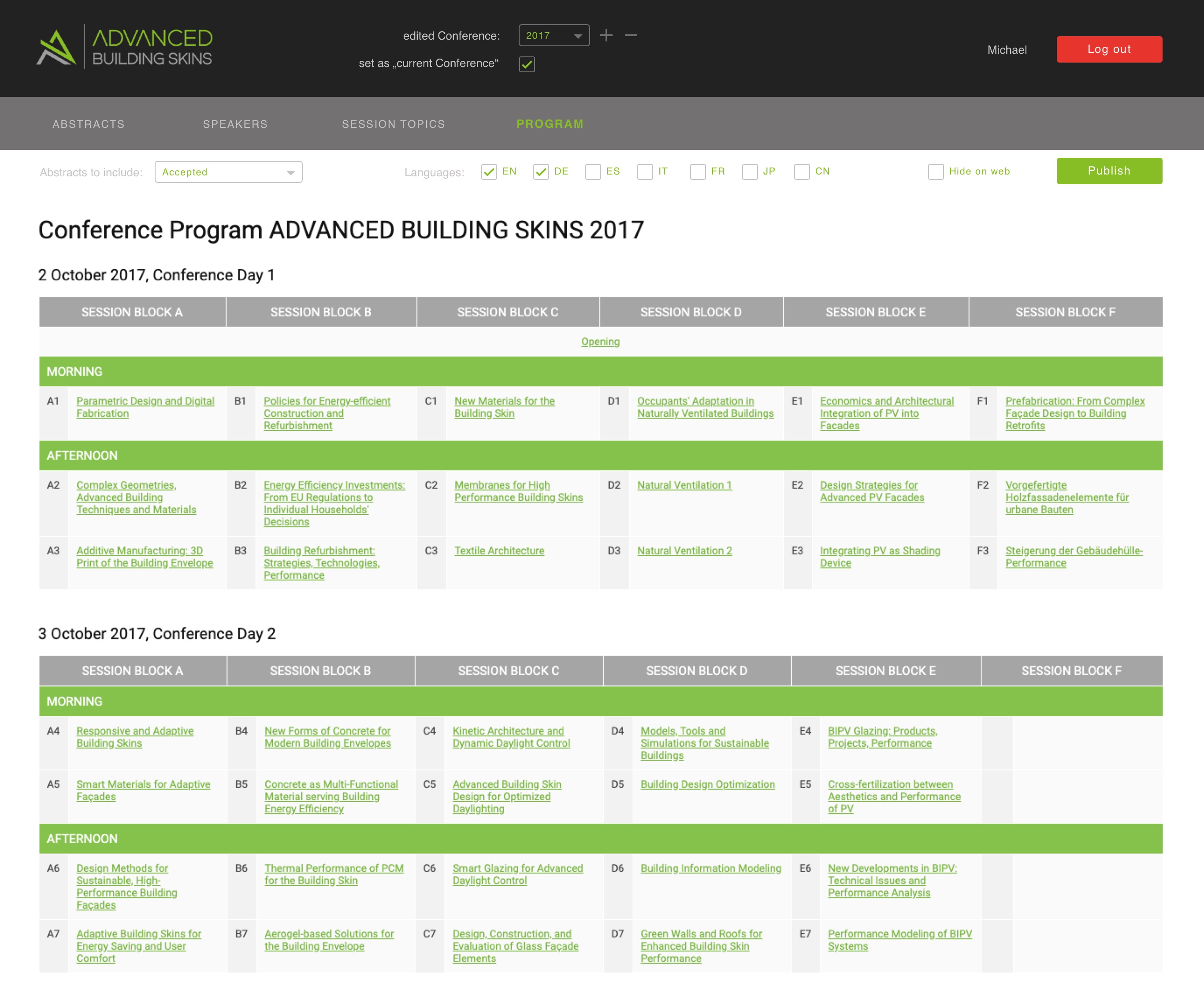
- Program Page
Their order in the menu was influenced by frequency of use. The special case was the Program page, which at some point of conference preparation together with the Abstracts turned into the most used pages. Thus, we decided to make them outmost in the menu list (Abstracts Page as the first and most commonly used; Program Page as the second one).
Let's go through the mentioned pages and briefly describe important decisions that were made and why.
Before we begin it would be helpful to define some basic terminology we have used in this project.
-
Terminology
-
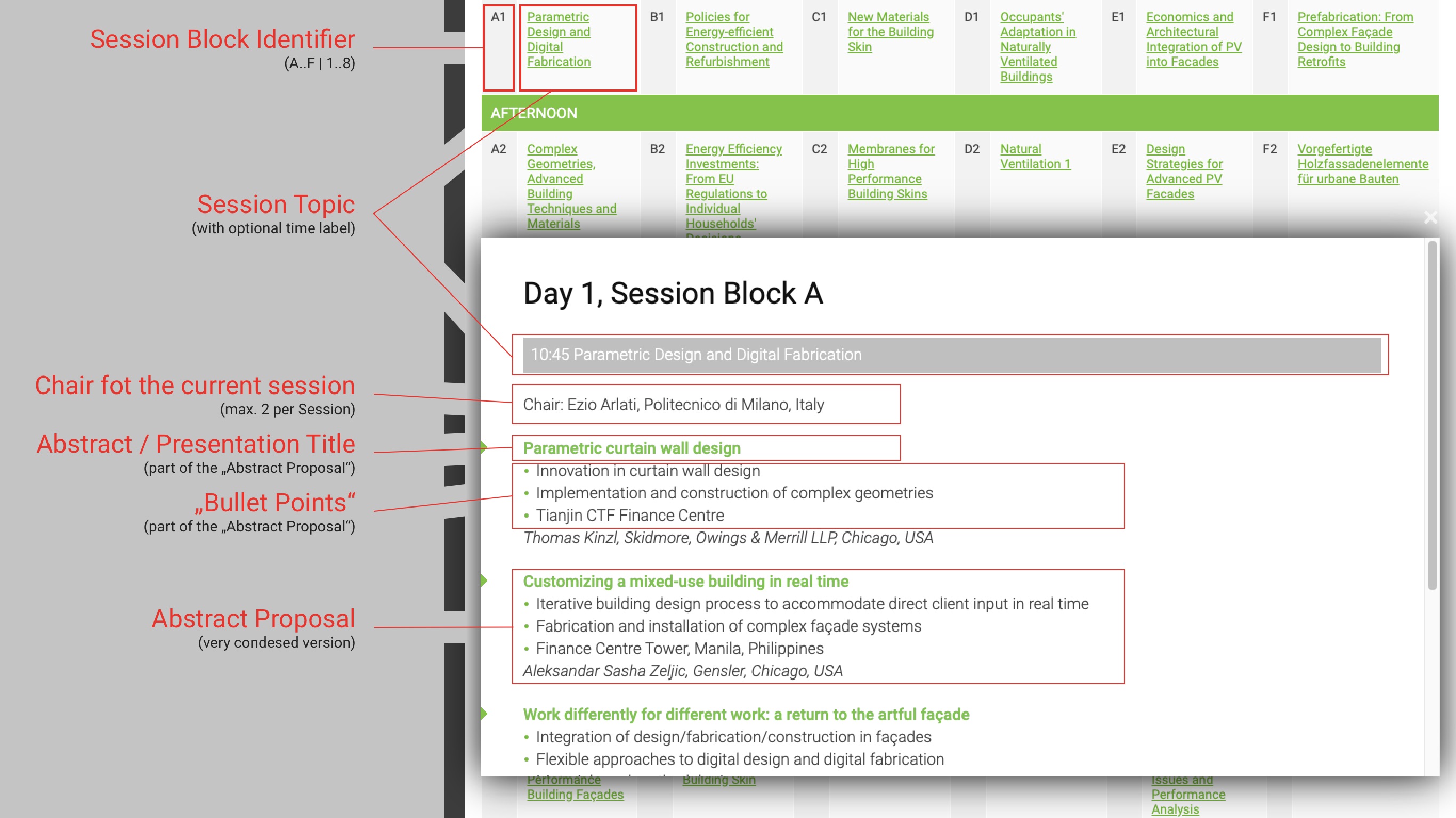
"Abstract" or an "Abstract Proposal" is a proposal sent by a potential participant regarding the topic which the participant wants to present at the conference. Each abstract has a title and "bullets points" - a short description made in 3-4 sentences (see image nearby).
- "Session Topic" is a grouping topic for a bunch of proposals which are grouped by some criteria (e.g. field of investigation, used technology, time range, etc.) (see image nearby).
- "Session Block Identifier" or just a "Session Block" is a short ID for the "Session Topic" used for ordering, restructuring and quick liking of "Session Topic"s (see image nearby).
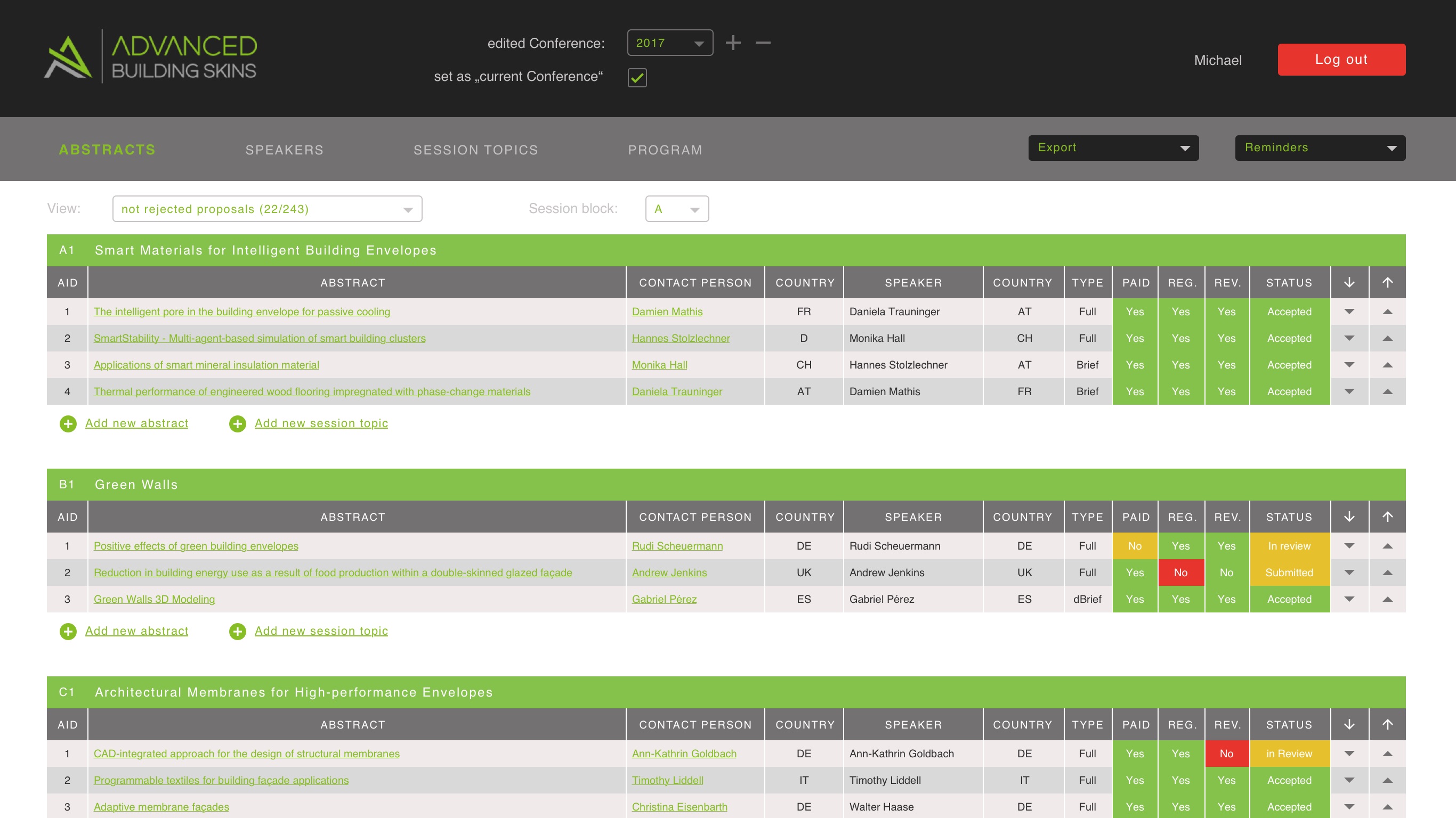
The Abstracts Page
This page is the most important page in the whole system. A "control panel" so to say.
It provides a clear view on submitted Abstract Proposals, their status, authors, speakers and payment status.
From this page you can:
- form the conference program, move Abstract Proposal between Session Topics;
- go to the Edit Page for each Abstract Proposal;
- generate reports;
- extract presentations and manuscripts within two clicks;
- contact corresponding authors regarding important updates;
- add a new Session Topic and an Abstract Proposal manually;
- send reminders regarding missing files, payment, abstract status update;
- etc.
User flows were built in a way to allow task completion within max. 3-4 clicks.
At that page we deliberately decided not to add an option to link a Session Block with a Session Topic. We implemented it on the Abstracts Page (Detailed view) so that an administrator has a better overview of the whole conference program and can (re-) assign Session Blocks without scrolling the page to the top / bottom to the next Session Block.
If the administrator decides to edit or change the status of submitted proposal, he clicks on its title and is redirected to the Abstracts Page (Detailed view) described below.
Such an obligatory redirection can be evaluated as a drawback. From another point of view, we made this decision because of the following:
- usually decision making regarding the Abstract proposal takes into consideration a variety of criteria, which we could not list on the current page;
- we also wanted to separate functionality areas logically like it often is done in OOP or Atomic Design.
- also we aimed to reduce the users' cognitive load for the page, split functionality into "bites" and reduce the potential amount of human errors. In other words, we decreased usability to increase it.
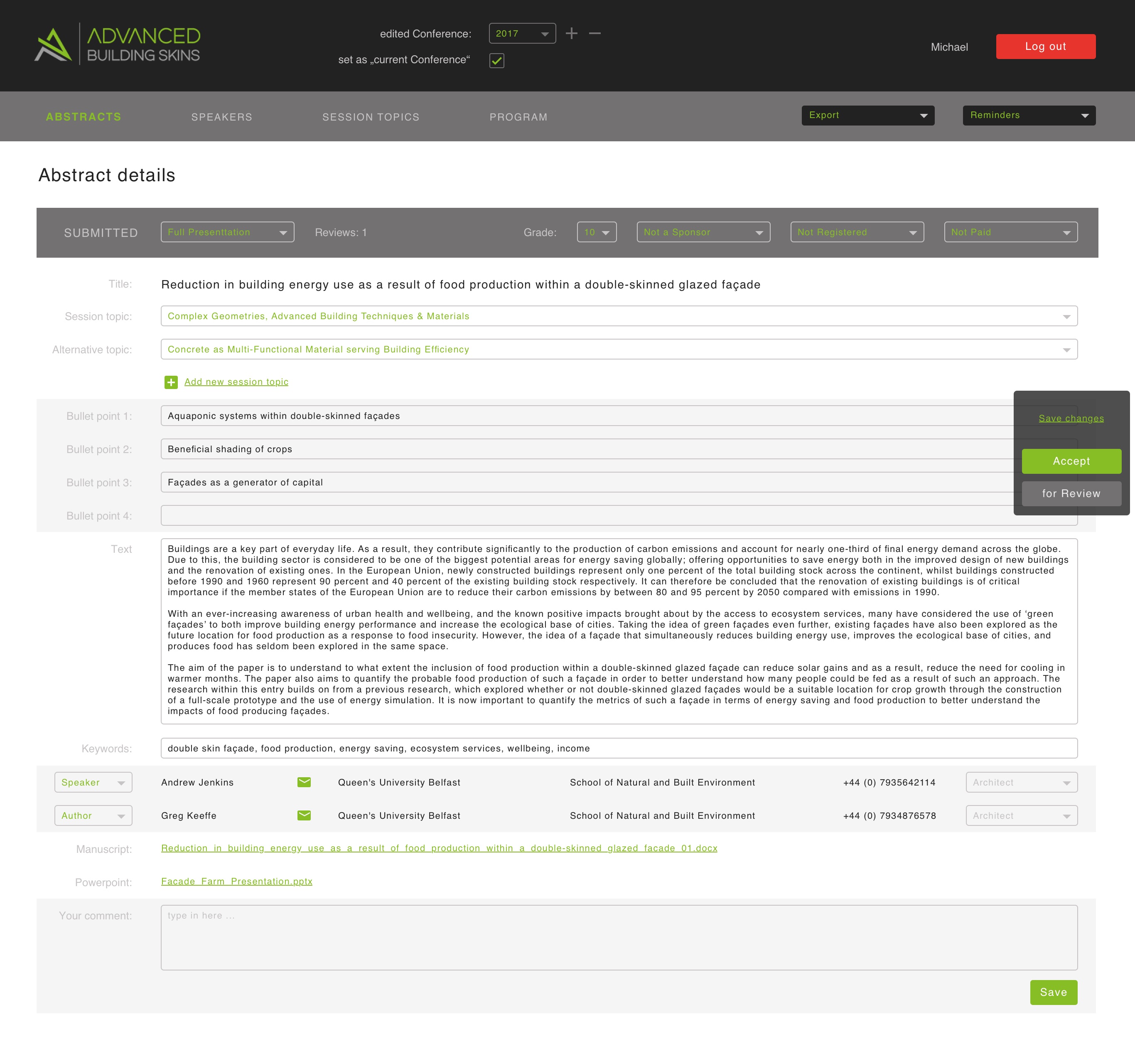
The Abstracts Page (Detailed view)
On this page all useful information regarding submitted materials and its status was listed.
For the most important functions like accept / decline proposal and save changes - a small floating control block was added (see image). Consequently, administrator could change & save abstracts' status / data or send it to review at any point of the page.
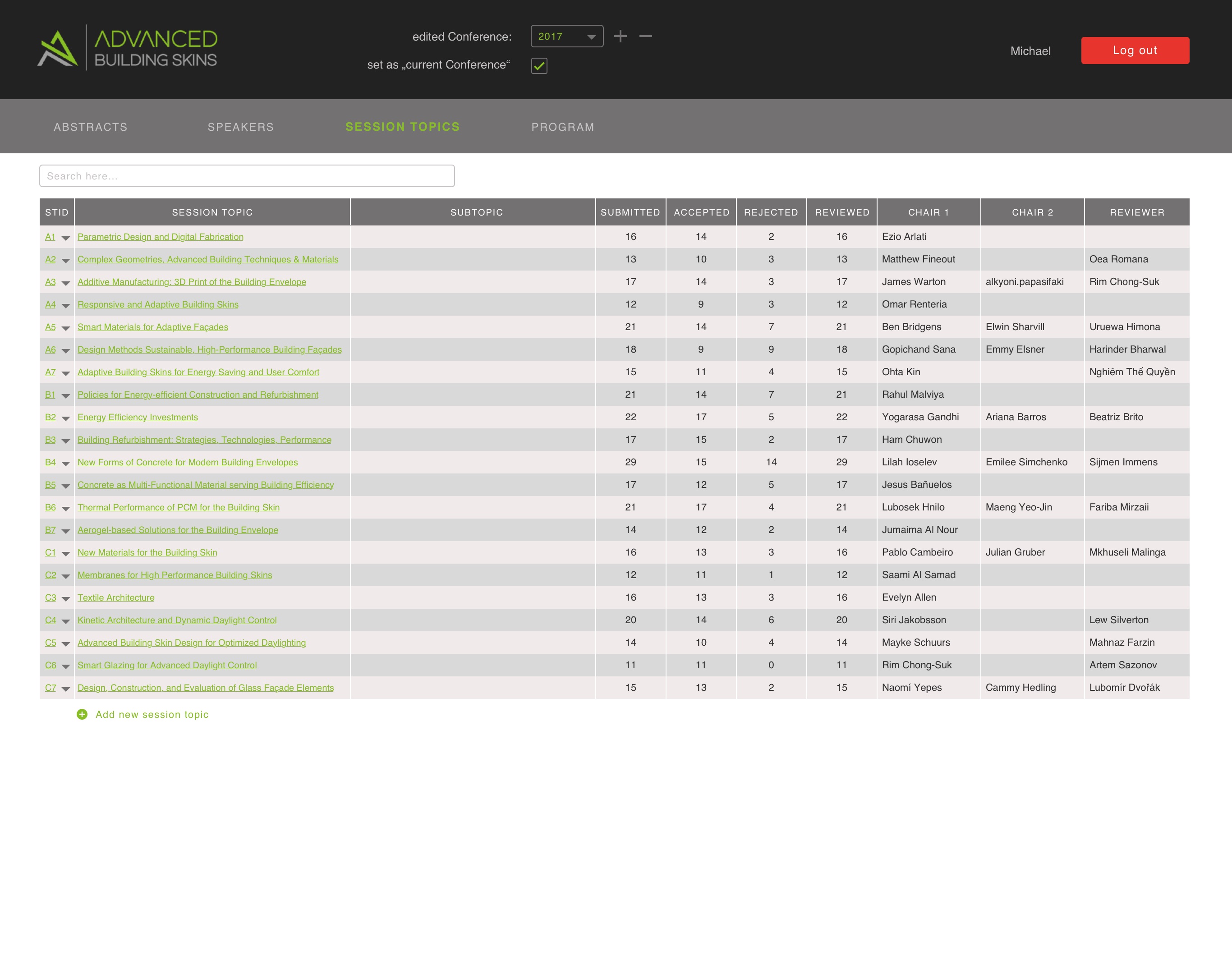
The Session Topics Page
This is a page of strategic planning of the conference program.
Here a user can easily rename session topics, change their order, set chairs and reviewers for them.
Also a useful statistics regarding the completion of each session is provided.
We assumed our power user has a lot of experience with Microsoft Excel, thus we put all the data in a big table with editable cells (similar to mentioned App). The only difference was the visual appearance and the background colour for even records.
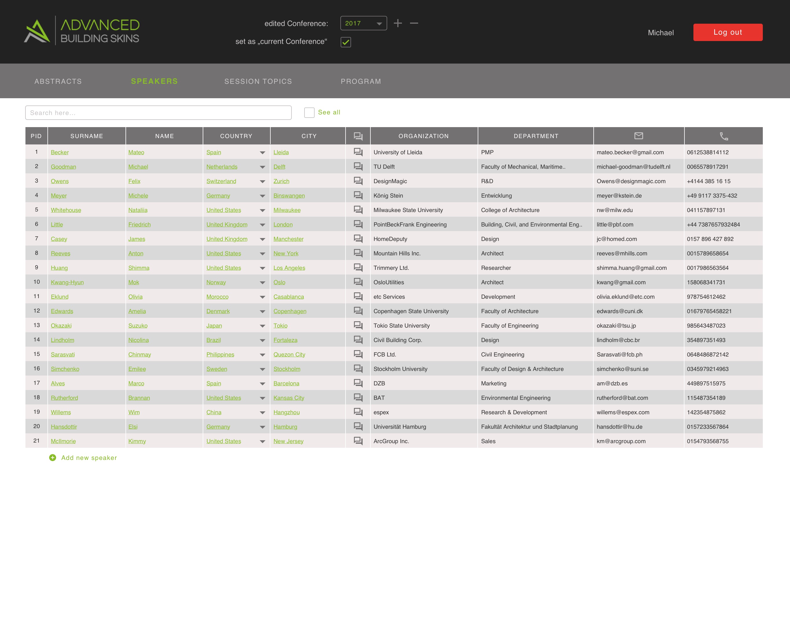
The Speakers Page
The Speakers Page was a relatively easy one.
Again, to make user flow shorter, we added a "Search" field at the very top and decided not to apply a pagination to that page at all.
We used a partial page load and customizable manual sorting by columns instead.
Our vision was: hundreds of (potential) participants will register in the system even for one conference.
In a few years we can talk about thousands of records.
Thus, a search of the desired record (using pagination) would take too much time.
But the use of a search field with a sorting option for found results will solve the problem very quickly.
Again, to make a usage pattern similar to Microsoft Excel, we used a big table on that page for all data with a double-click (on the cell) option to edit records.
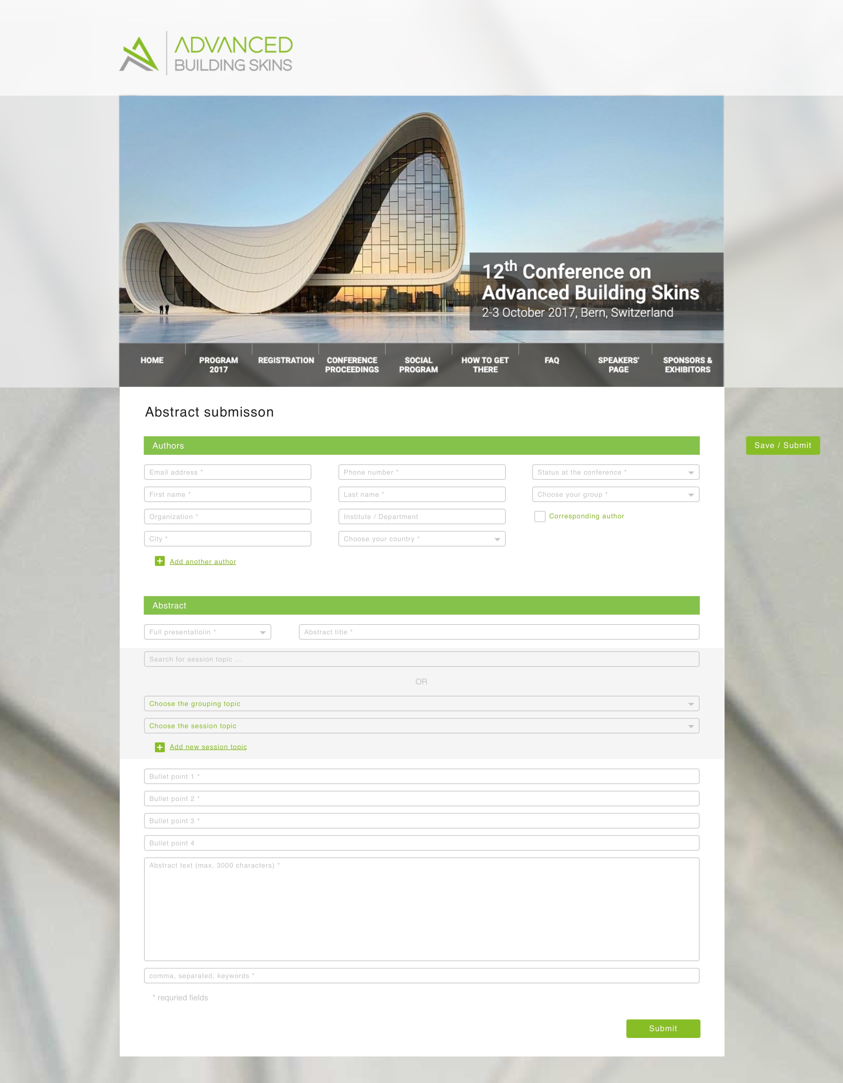
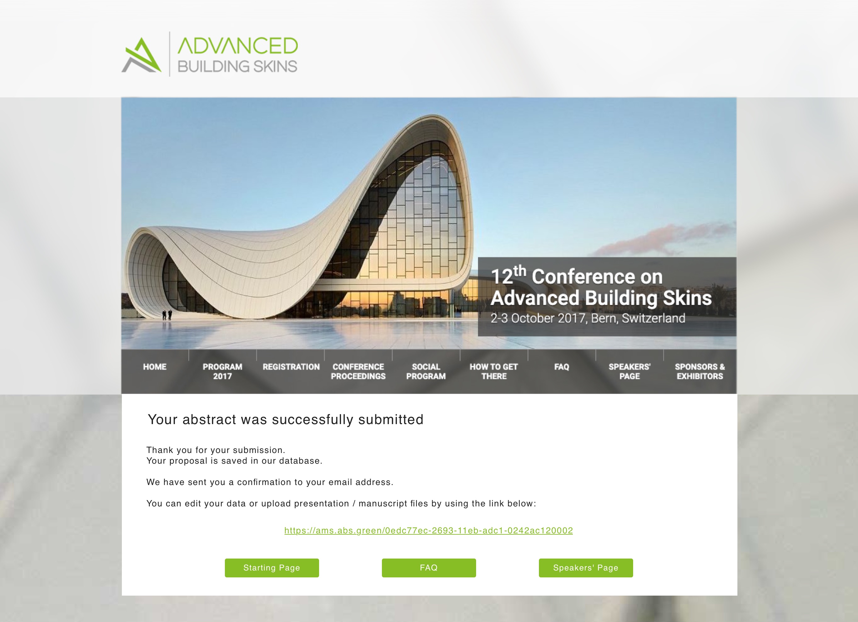
Abstract Submission Page
This page was built for client's clients.
Its main goal was to allow users to submit / update their abstract proposals directly or upload a file.
In other words, main functionality of current page was:
- assign up to 20 authors for each abstract submission;
- provide all required info about authors;
- upload all required data regarding abstract proposal;
- update any information if needed;
- in case the proposal is accepted - upload presentation and full manuscript.
Since as all we had experienced that unavoidable time-consuming, which-login-password-have-I-used-for-that-site registration on the websites where you only needed to take a few actions, we decided not to use personal profiles but still wanted to automate major routines. This was implemented with the following options:
- email as a unique ID: once the user entered their email, it could be used for all subsequent submissions. User data was updated in the same form as always by simply overwriting the old data;
- after the submission corresponding author received an email with all data needed for further access & materials upload;
- each abstract got an unique URL such that information update, status check or full manuscript / presentation upload could be performed;
- in case of technical questions / problems there was an email address always accessible for the contact. Alternatively, we planned to develop a small self-guided form to help fix common user problems without human interaction.
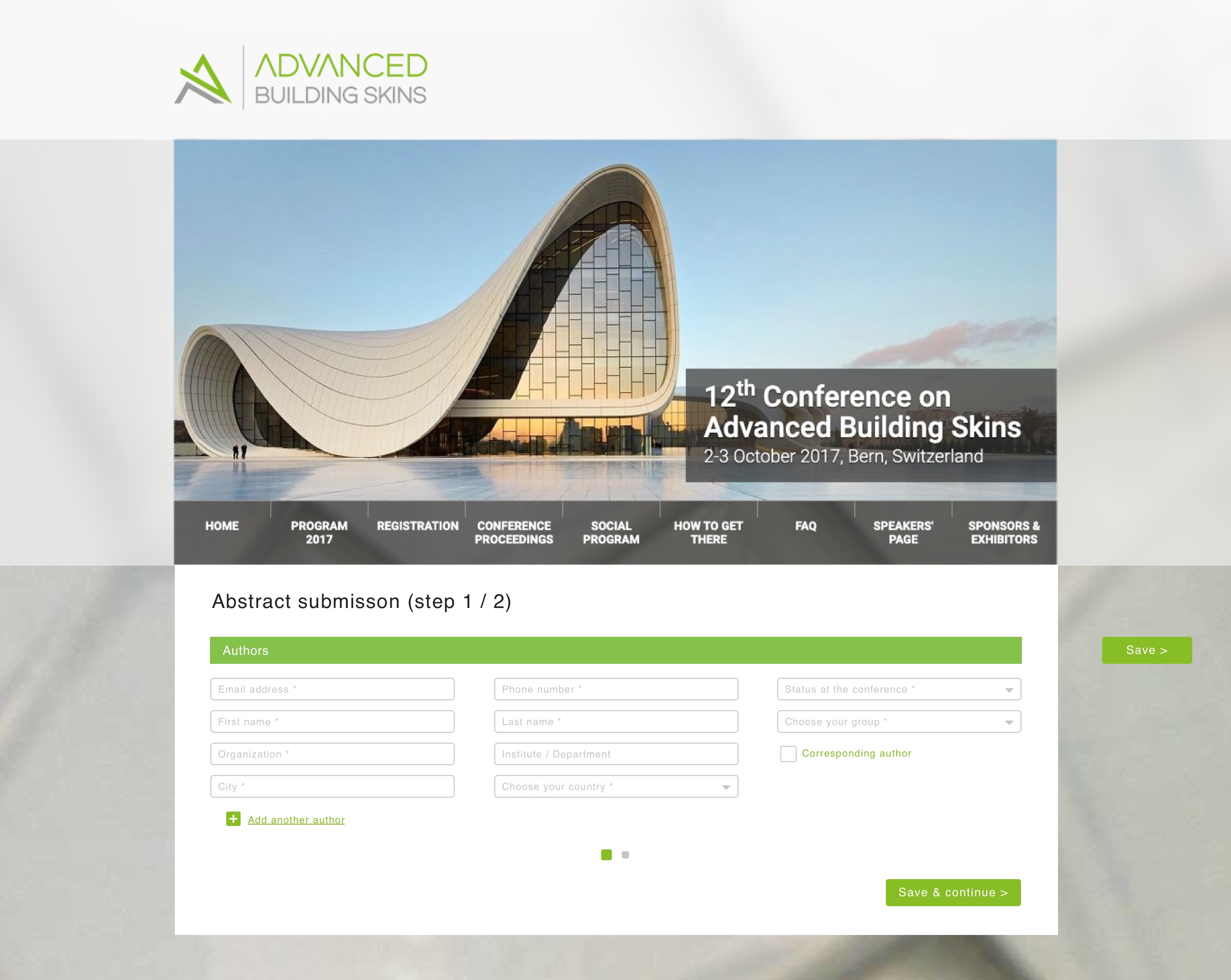
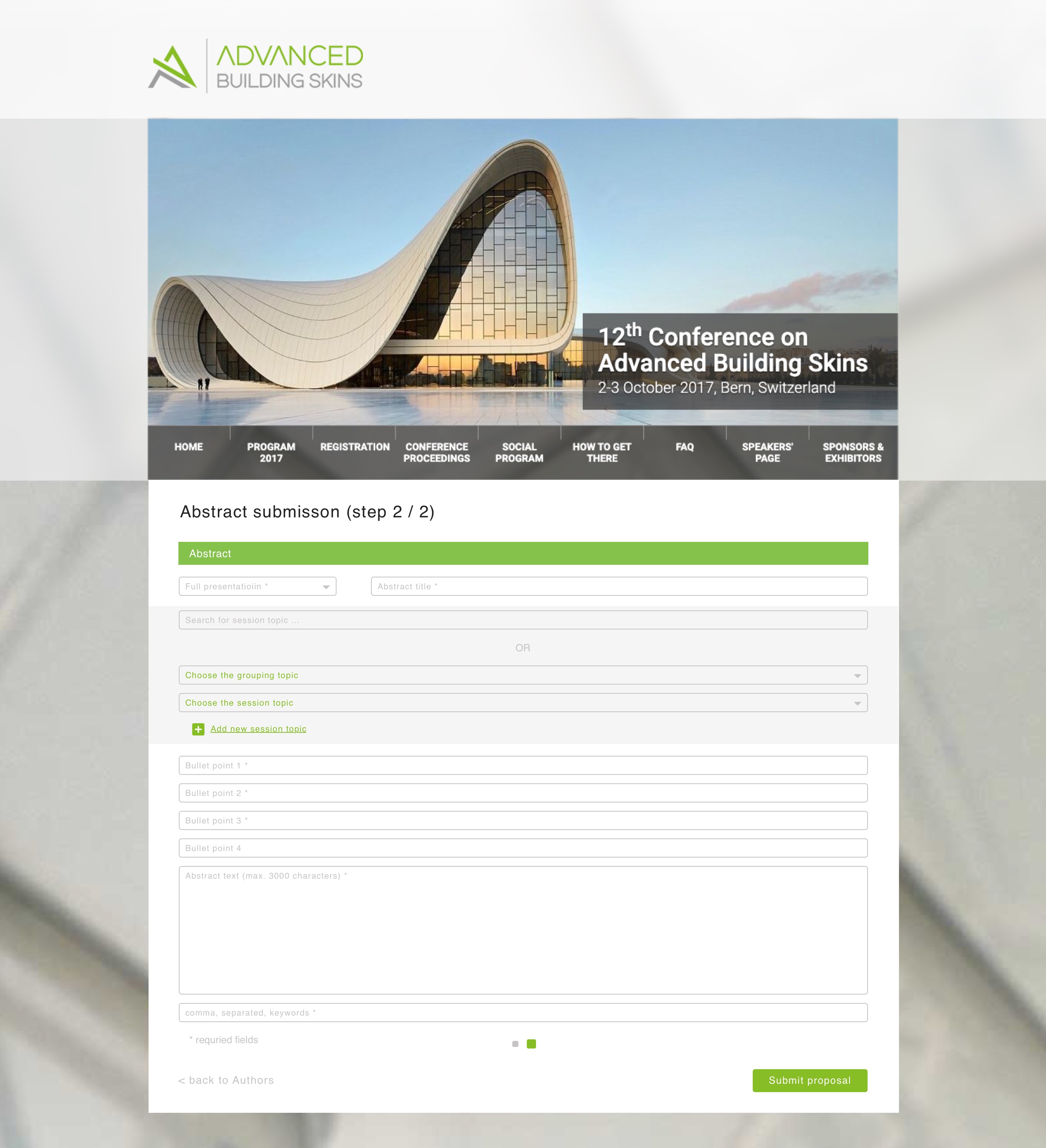
All in all the mentioned specification was implemented in two versions of the page - in the first one all required data could be entered at once, in the second - it was divided into two subpages (with "Authors" and "Abstract" subforms).
The first version (one-page)
We assumed that because of a big amount of text, which has to be inserted as an abstract description, our clients will use laptops and desktops for this task.
Usually, they are also quite motivated and intelligent. Thus, a one-page form should not be a problem for them.
Technically we divided one big form into two small ones and provided a "Save" button (to use on any stage of the data filling process) to avoid any possible data loss (in case of problems).
For the worst-case-scenario the "authors" subform was moved to the top so that once saved this data could be restored in seconds. Otherwise, copy / paste extensive data of abstract description could lead to poor UX.
The second version (two-page)
In this version we used the same principle of data priority with the difference that subforms were split into pages to make the amount of fields more attractive and split the process into two "bites".