UX Process
In general
Overall the whole project could be split into three parts.
First, we focused on understanding of the task given to us.
In this phase we also generated ideas and defined a product which had to satisfy stakeholder's requirements.
In the second stage we focused on the product development, its basic functionality and user testing.
The last activity block was to develop a wireframe prototype in Adobe XD and again test it with "real customers".
Now we will go through all those methods we used during the whole process (consequently, but independently from the stages mentioned above) and describe their goals, specificity and expected outcomes.
Also, our deliverables will be provided.
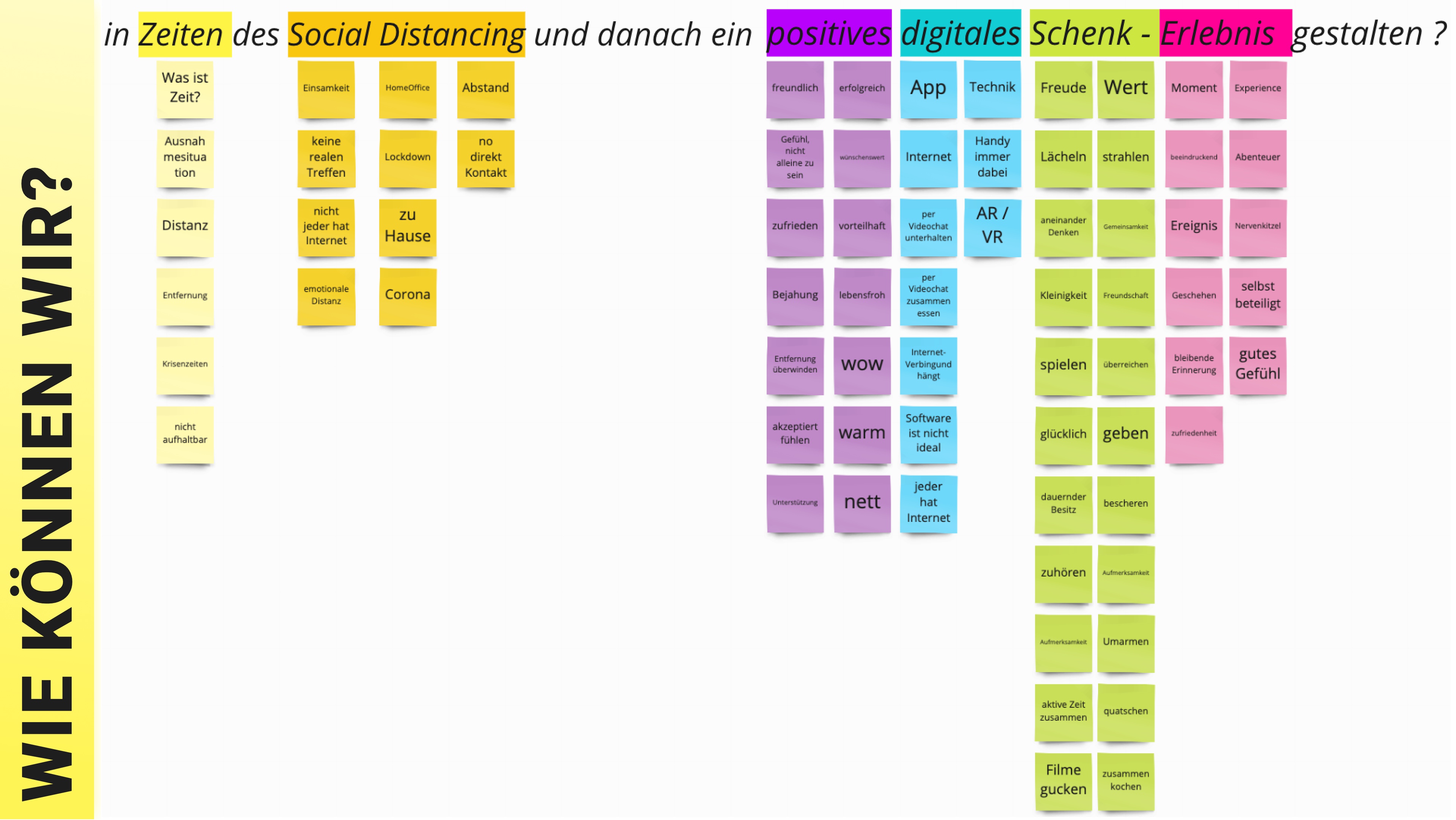
Semantic analysis
For that task we had to analyze six words and word combinations: "Social Distancing", "giving", "experience", "positive", "times" , "digital".
We used Miro to generate, present and save our arguments and associations.
We split up into four different zones of the virtual space and used some time to describe our personal vision for each of the mentioned words.
Afterwards we discussed our solutions, deleted repetitions and eliminated unpopular or imprecise proposals.
By the time all of the mentioned cards were grouped into the holistic picture.
This exercise gave us a common understanding of the core terms used in the given Design Question and we could form a common vision for each of them.
Initial Project Questions
To move forward we had to define a general perspective of how we are going to implement our common vision of the given task.
Exactly for that case answering Initial Design Questions was very beneficial.
Of course, at the very beginning (where we were) we could neither answer in detail to them nor provide a more useful information for the concept of the product.
But we could define basic requirements for the task and encounter in which direction we had to go in the first place.
Another important feature - this exercise prepared us for the user interview, which followed afterwards.
You can find our answers regarding the product in the image nearby.
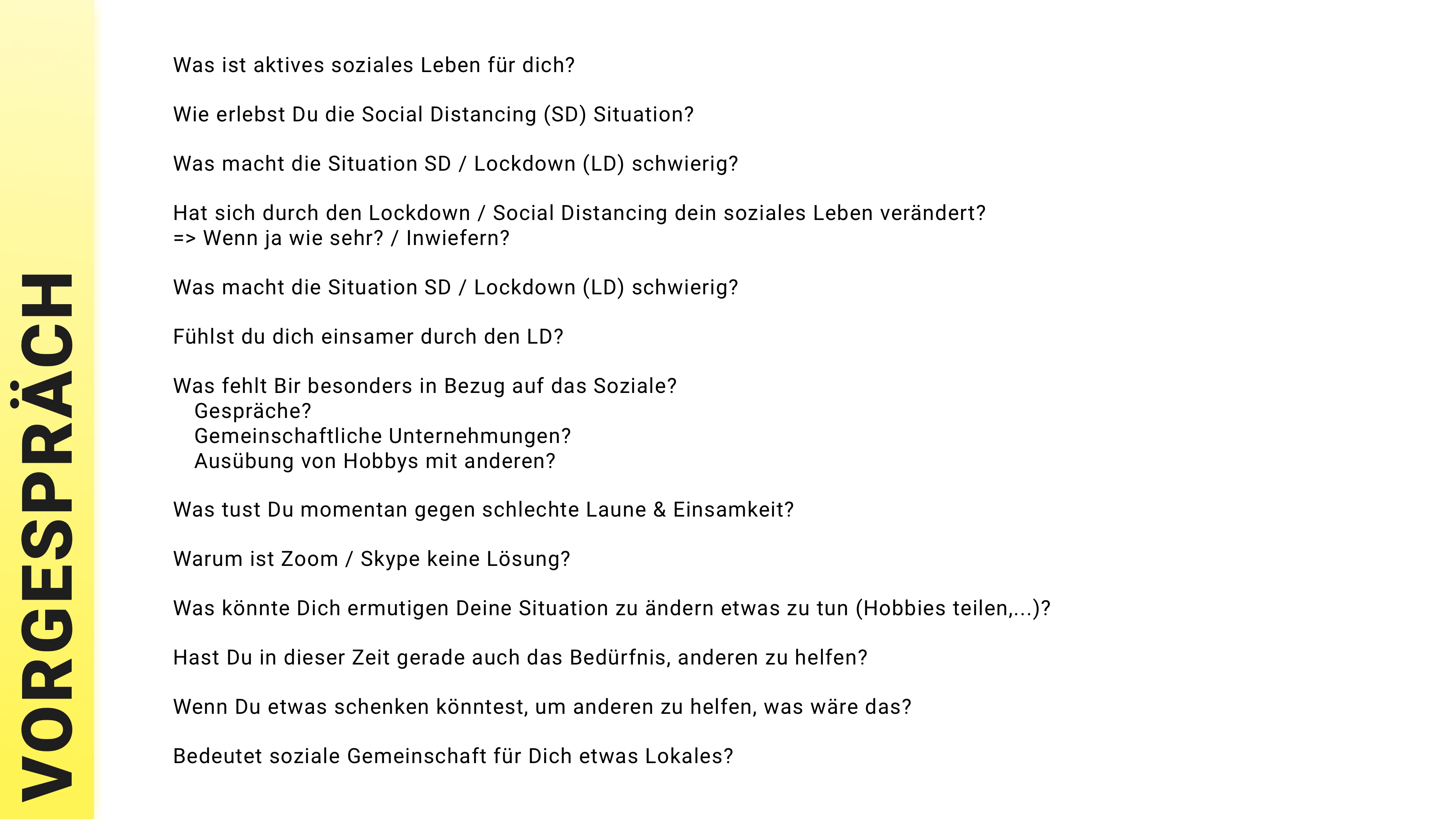
Preliminary Interview
This exercise also had a strategic value for our project.
With our vision in mind each of us developed questions he / she found important to ask.
Then we discussed all of them together, formed a final list of selected questions and ordered them.
The next step was conducting an interview.
All important questions were asked and also some additional ones were appended.
We did it in cases when it could provide us more important details or when the person demonstrated an interest, attention to the discussed theme.
We tried to go slowly and step by step understand the underlying needs and core motivations of our guests.
We practiced the rule: "listen more, talk less".
All in all, we conducted interviews with three partners - two women and one man.
All they were about the same age group and had similar characteristics.
You can find the full list of questions asked in the image close by.
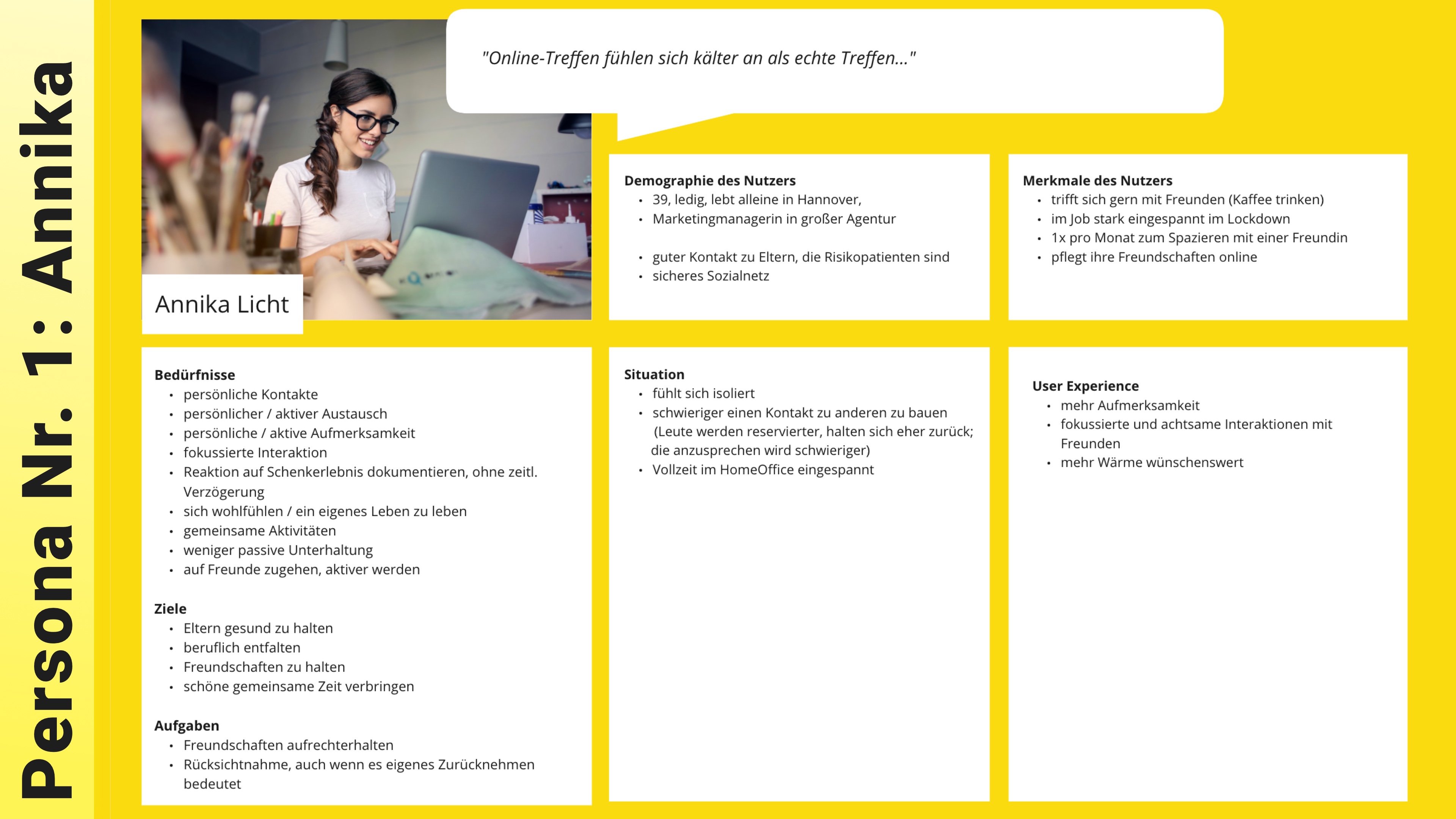
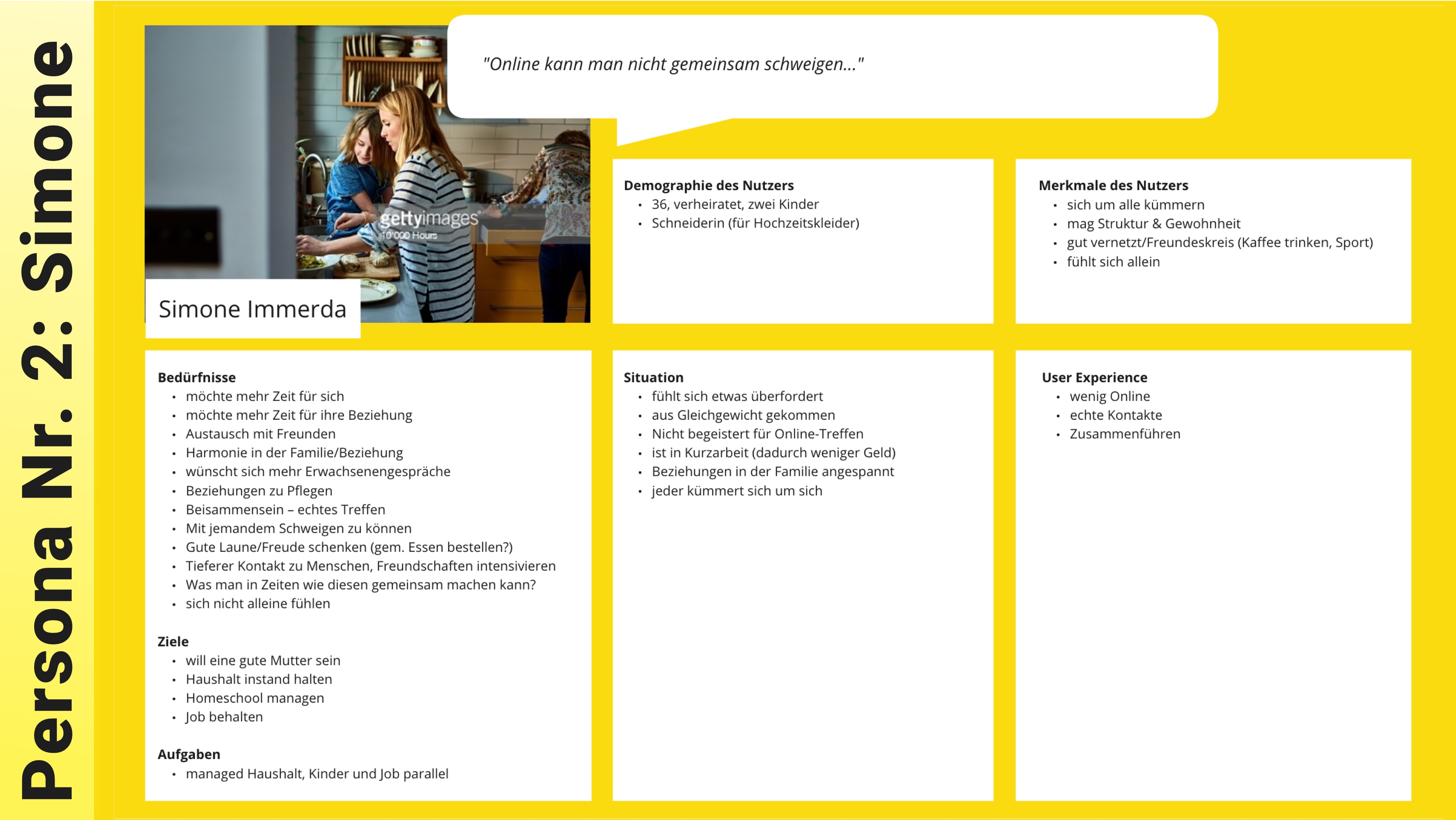
Personas
Our main findings were discussed and evaluated.
We decided to create two personas - "Annika Licht" and "Simone Immerda", which represented our female participants.
In the majority aspects they were quite similar but still had their personal differences and needs.
Thus, we decided not to combine them into one persona, but to choose only the dominant one.
At the end of the day, we chose the "Annika Licht" profile.
We assumed that a use case of that person was familiar to the majority of our potential target group.
Moreover, it was easier for us to find (in our course group) someone similar to the chosen profile for further user testing.
Needsboard
In this stage we decided to go deeply into our findings and identify or just extract directly mentioned or potentially relevant user needs.
We split up our group again and everyone looked at the data from his / her own perspective.
After discussion we made some filtering and clustering of generated results.
As you can see on the picture, there were four main groups of user needs - "self-oriented", "activity-centered", "reality-dependent" and "interaction-oriented".
In general, we found quite a lot of demands, which we took into account for further product development.
This provided us with a focus we needed in the next stage.
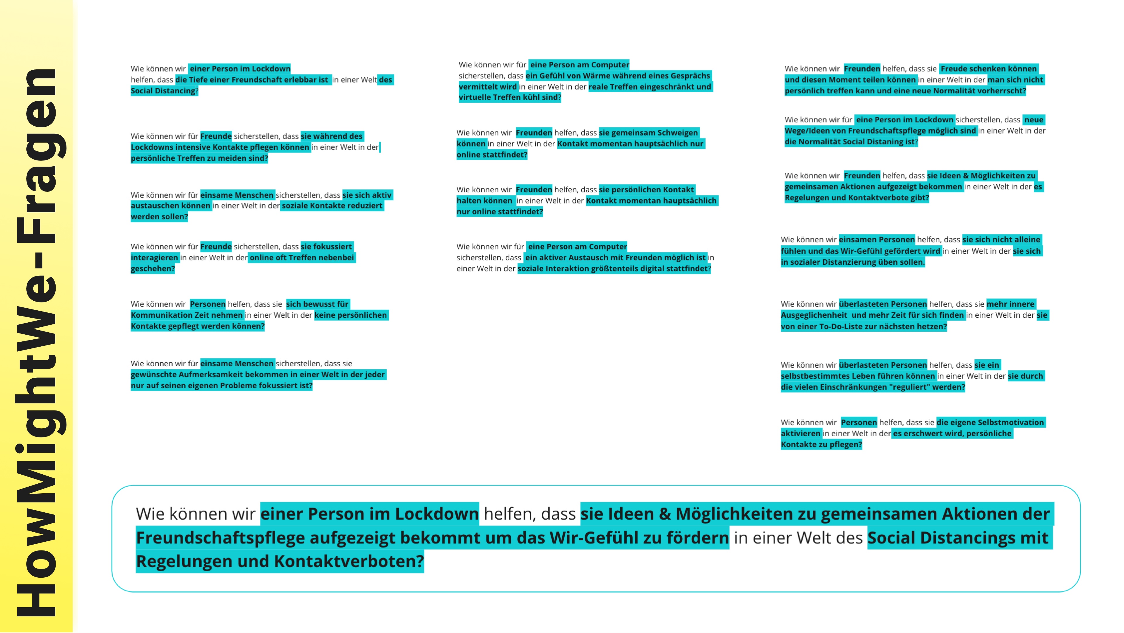
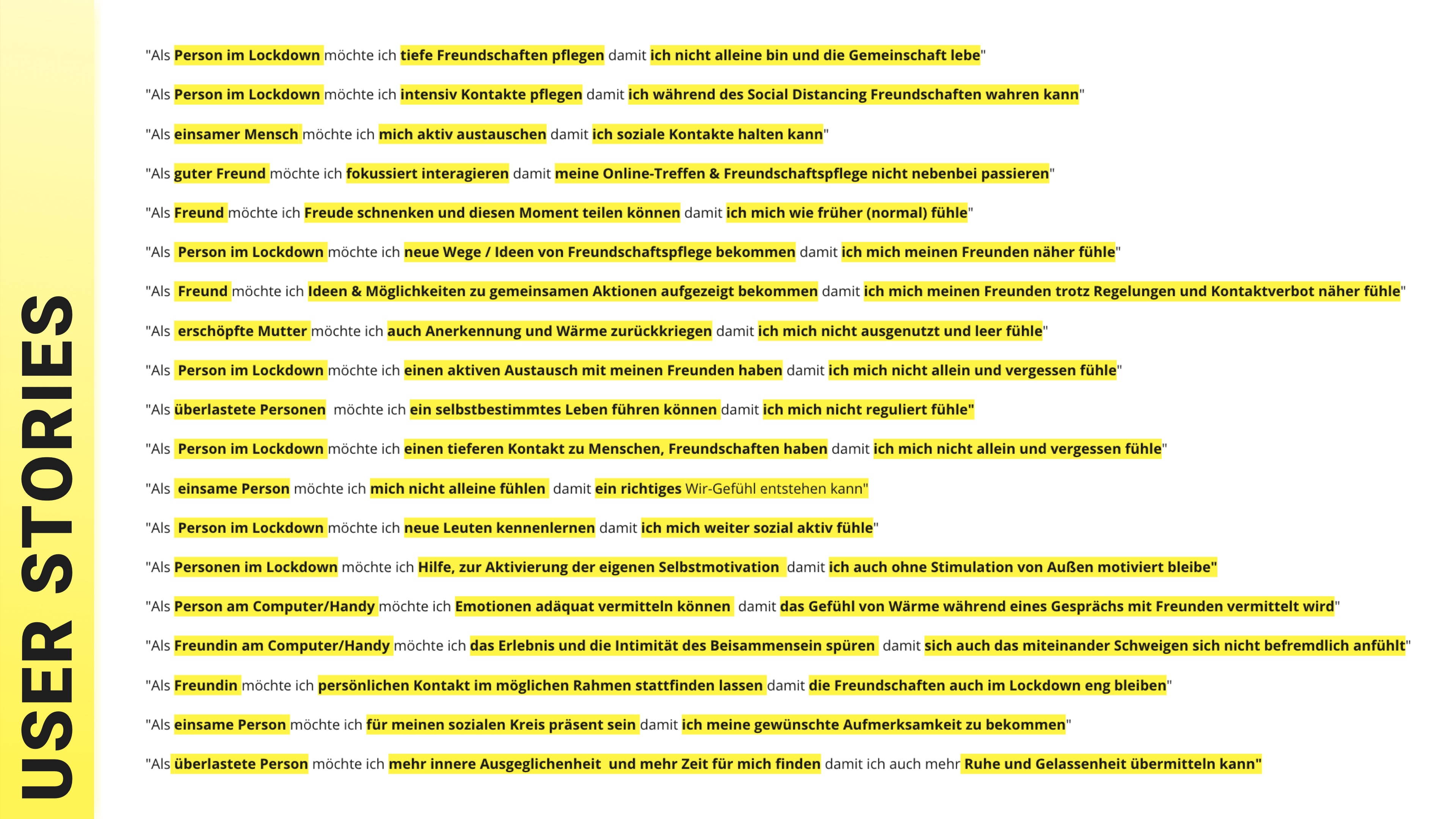
HMW-Questions + User Stories
During this part of the development process we formed a list of potential use cases, which were or had to be known to our personas and which reflected their needs in their potential activities.
As always, this list was intensively discussed, extended, filtered and regrouped.
Focusing on the list we produced, a much bigger list of HMW-Questions was generated.
"HMW-Questions" are also known as "How Might We? - Questions".
Having all that in mind, each group member voted with three points for the questions he / she found very important.
The most popular items were moved to a separate box and again highly discussed.
As a result, we combined two somehow similar queries and reduced the general amount of them.
After that one more voting procedure took place.
Thus, our main Design Question for the product became:
"How can we help the person in Lockdown to get / see ideas and possibilities for joint activities and care of friendship with the goal to encourage the "WE-feeling" in the world of Social Distancing with strict rules and contact prohibition
As usual, the list of use cases and HMW-questions can be found on images below.
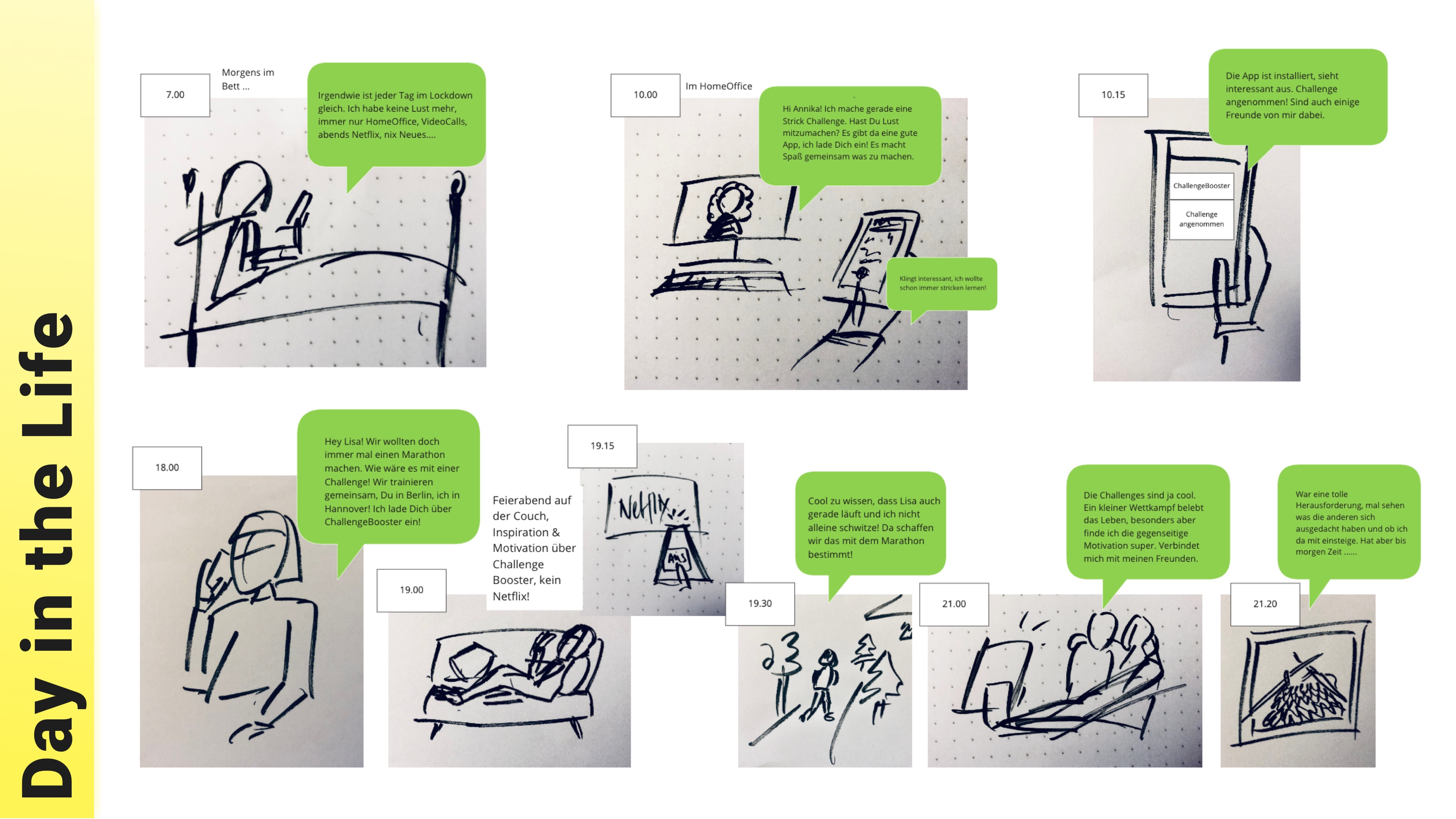
A Day In The Life
This method helped us to put ourselves in our persona's shoes.
With some imagination we reconstructed how the chosen personality goes through the everyday routine and what she feels at each moment.
Also, we created a vision how a persona's daily activity can be changed by our application and how those daily tasks can be modified.
We also assumed that our product will have an impact on the customer's friends' life and their socialization.
And we demonstrated it in our outlook.
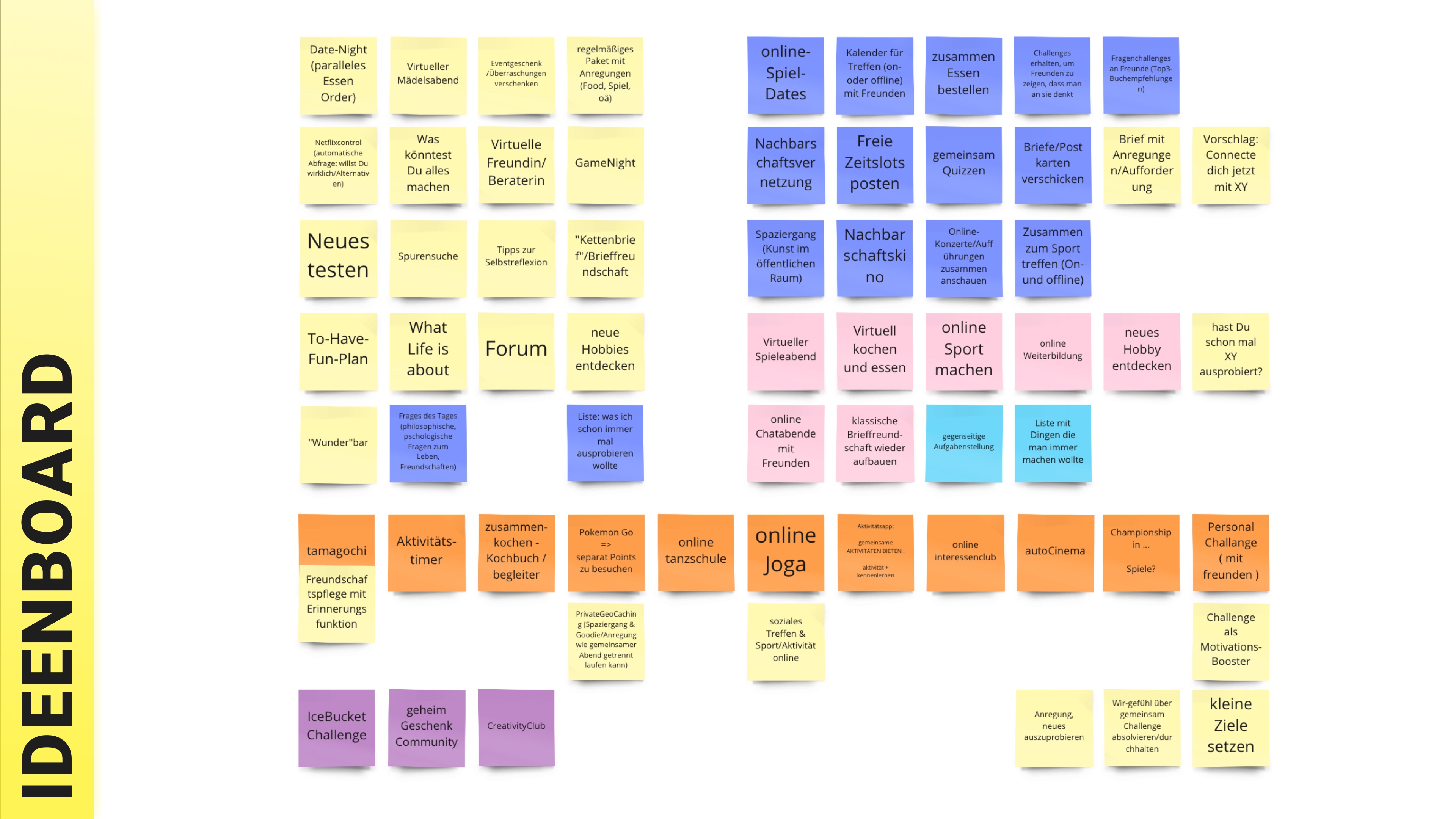
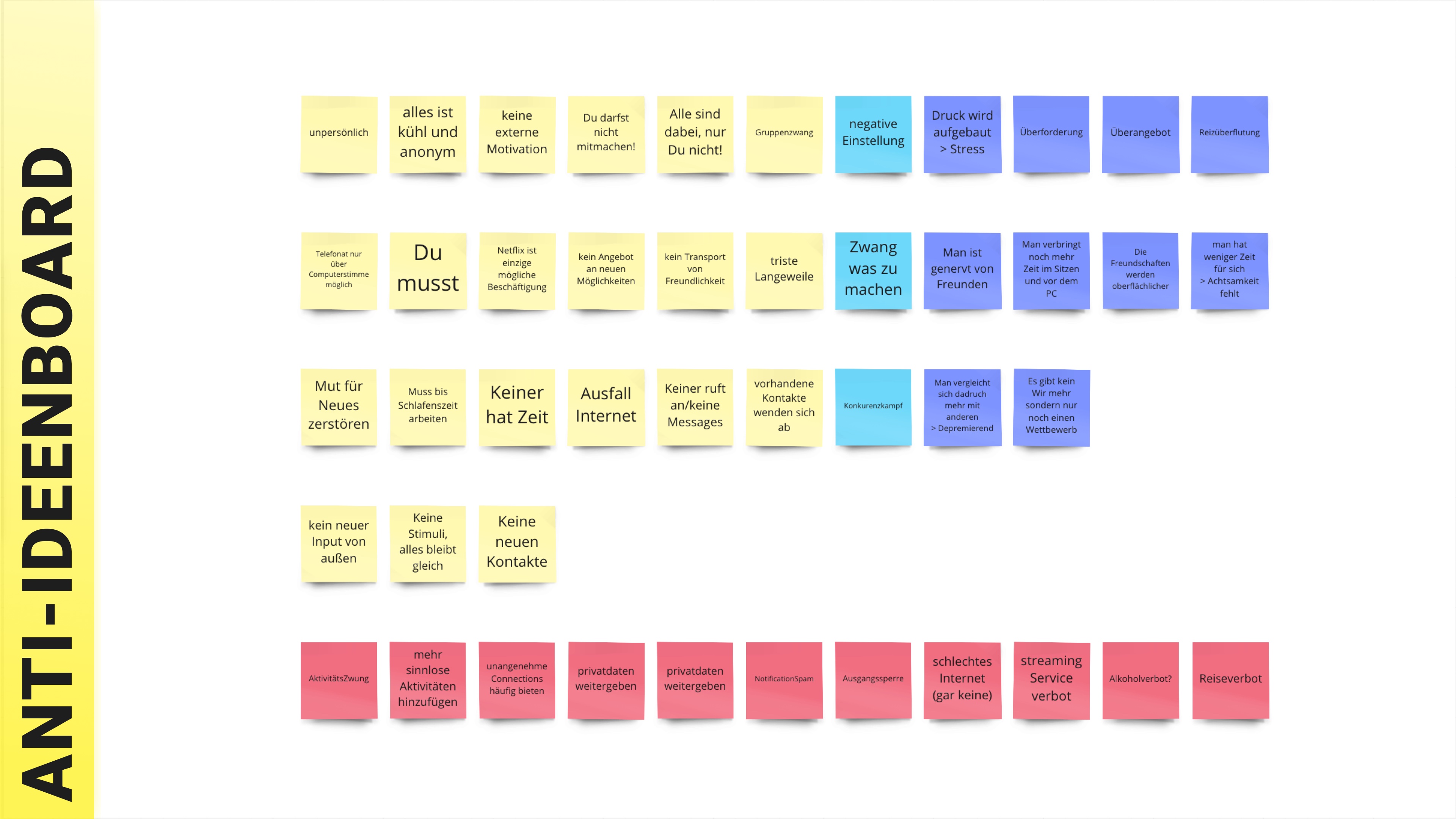
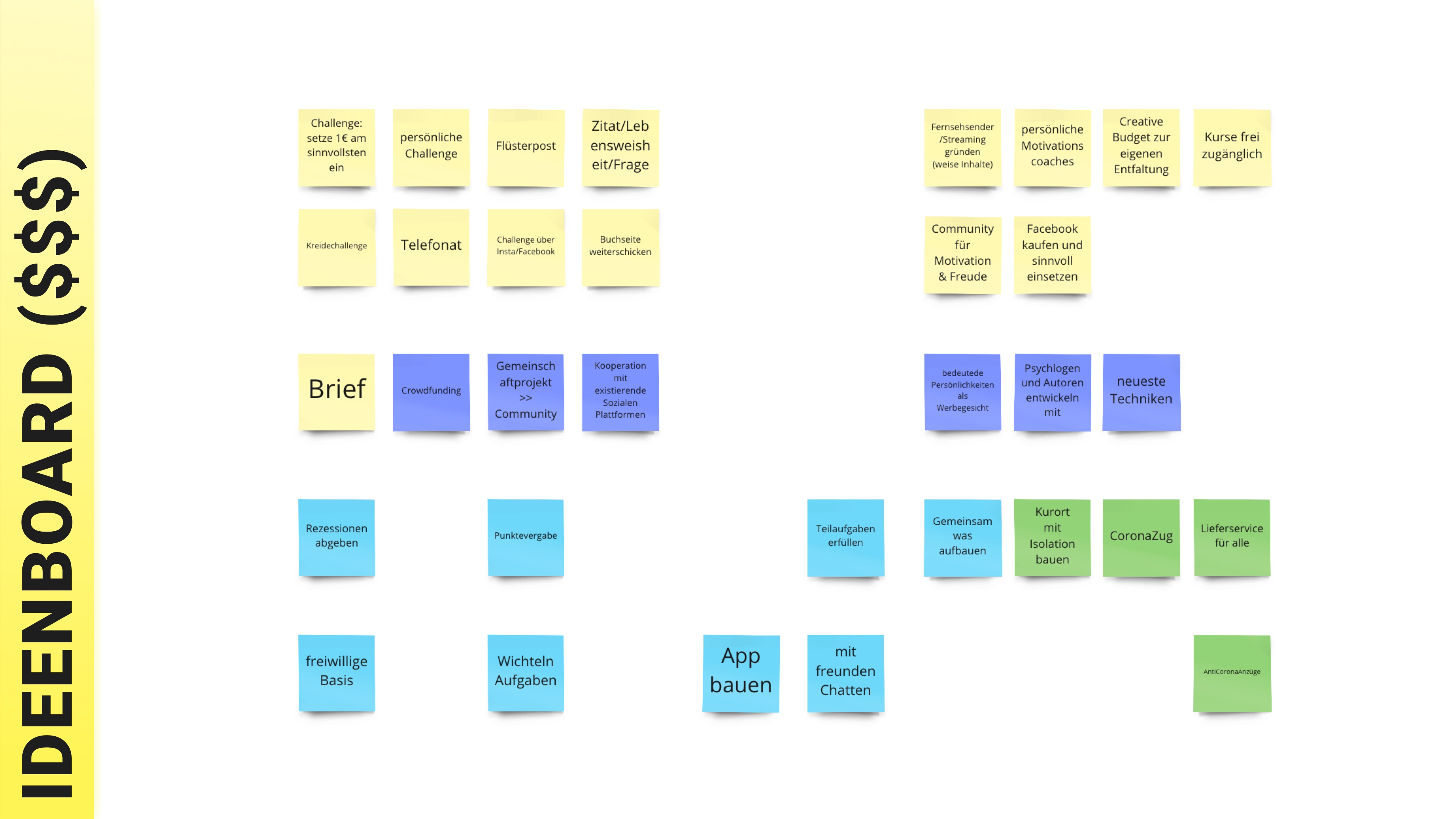
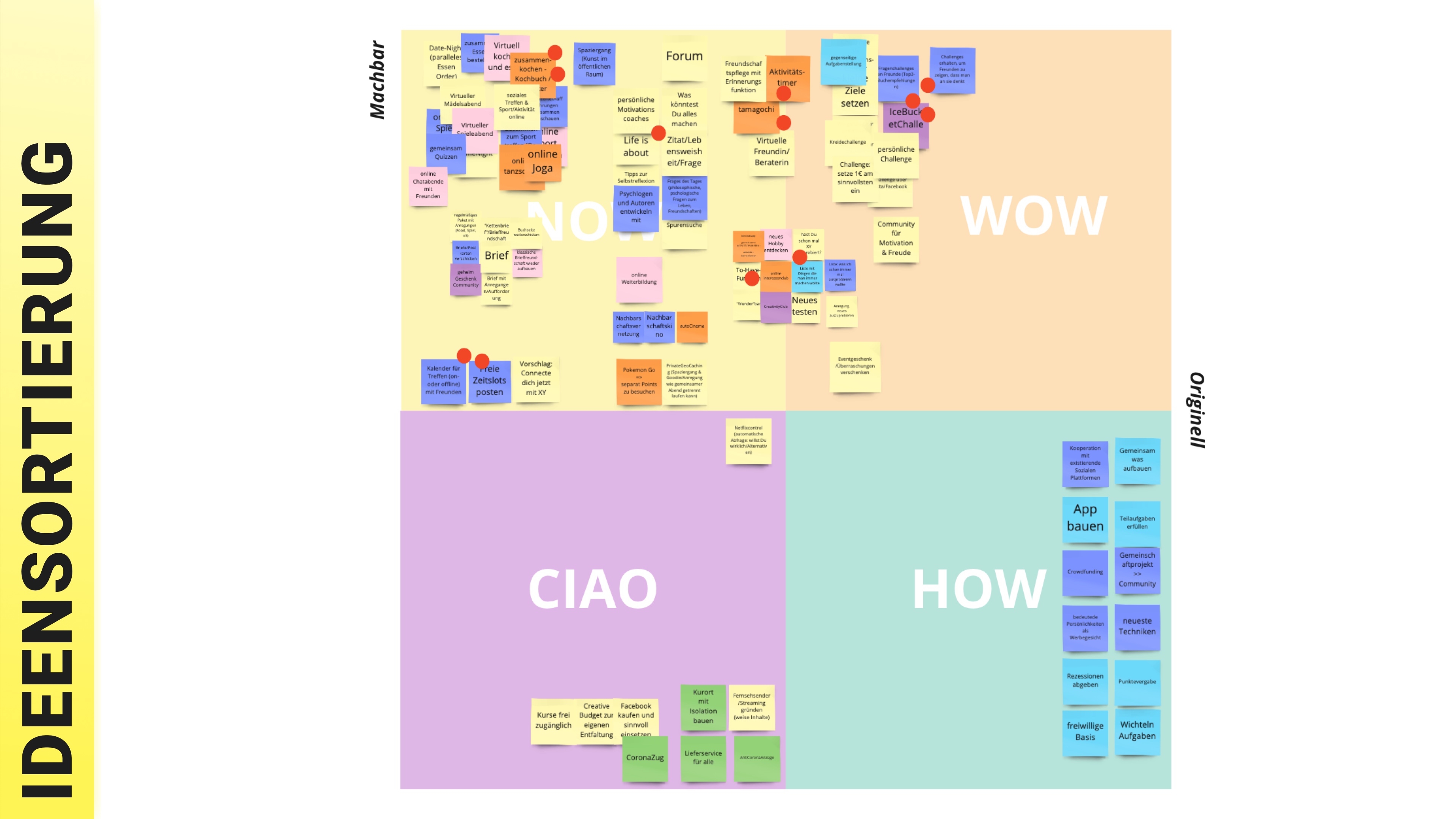
Ideenboards
To generate a sufficient amount of ideas we split up our group again and made a few brainstorming sessions with an idea sharing in-between.
We grouped all unique ideas on the same Idea board.
Then we repeated the same actions but with an intention to generate ideas for making our persona's life as terrible as possible.
This resulted in the "Anti-Ideenboard".
The next step was to assume that we have all the money in the world.
And we tried to solve the persona's problem with it.
Ideas were collected on the "Ideenboard ($$$)".
As the final step we moved our proposals from the "Ideenboard" to "NOW / WOW / CIAO / HOW" board.
In other words, we sorted them into categories of "doable" / "cool" / "bad" and "not-completely-clear-how-to-implement-it" solutions.
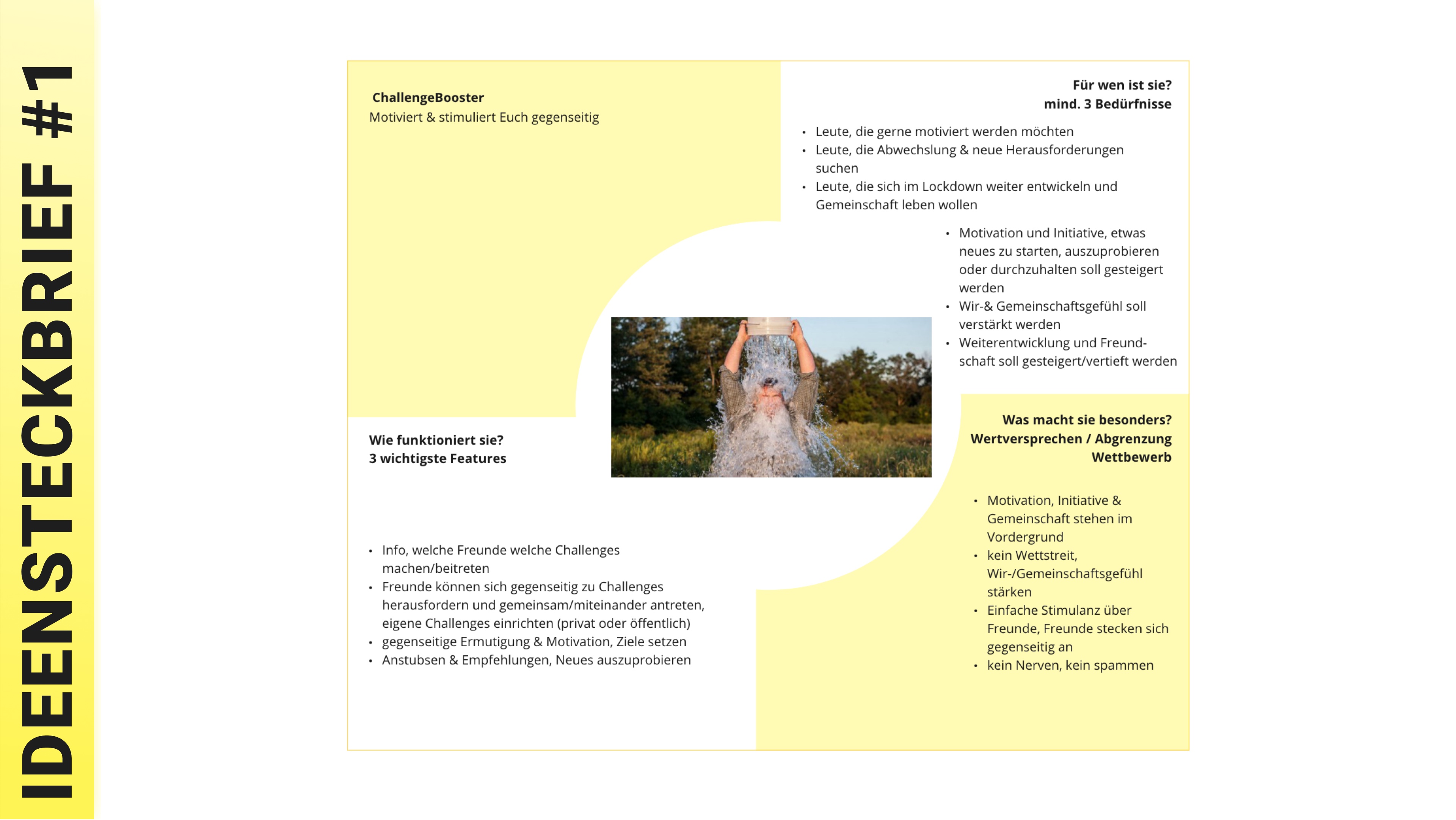
Idea Letter
In the current stage we had to decide which ideas we take into further consideration and to develop a vision of the prospective product.
To make this possible we voted for interesting ideas and chose four most popular ones.
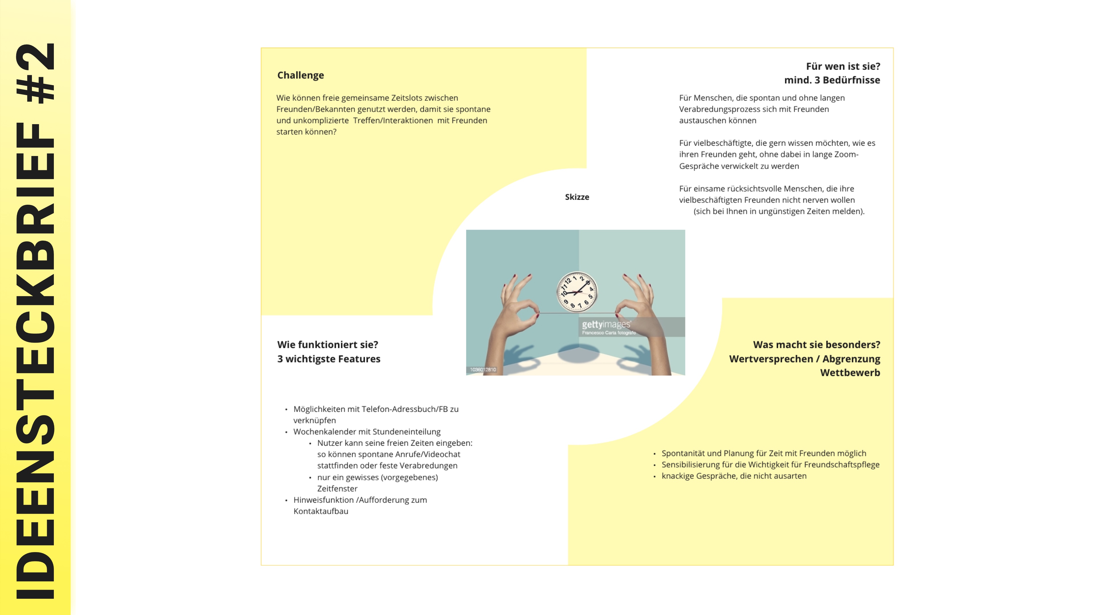
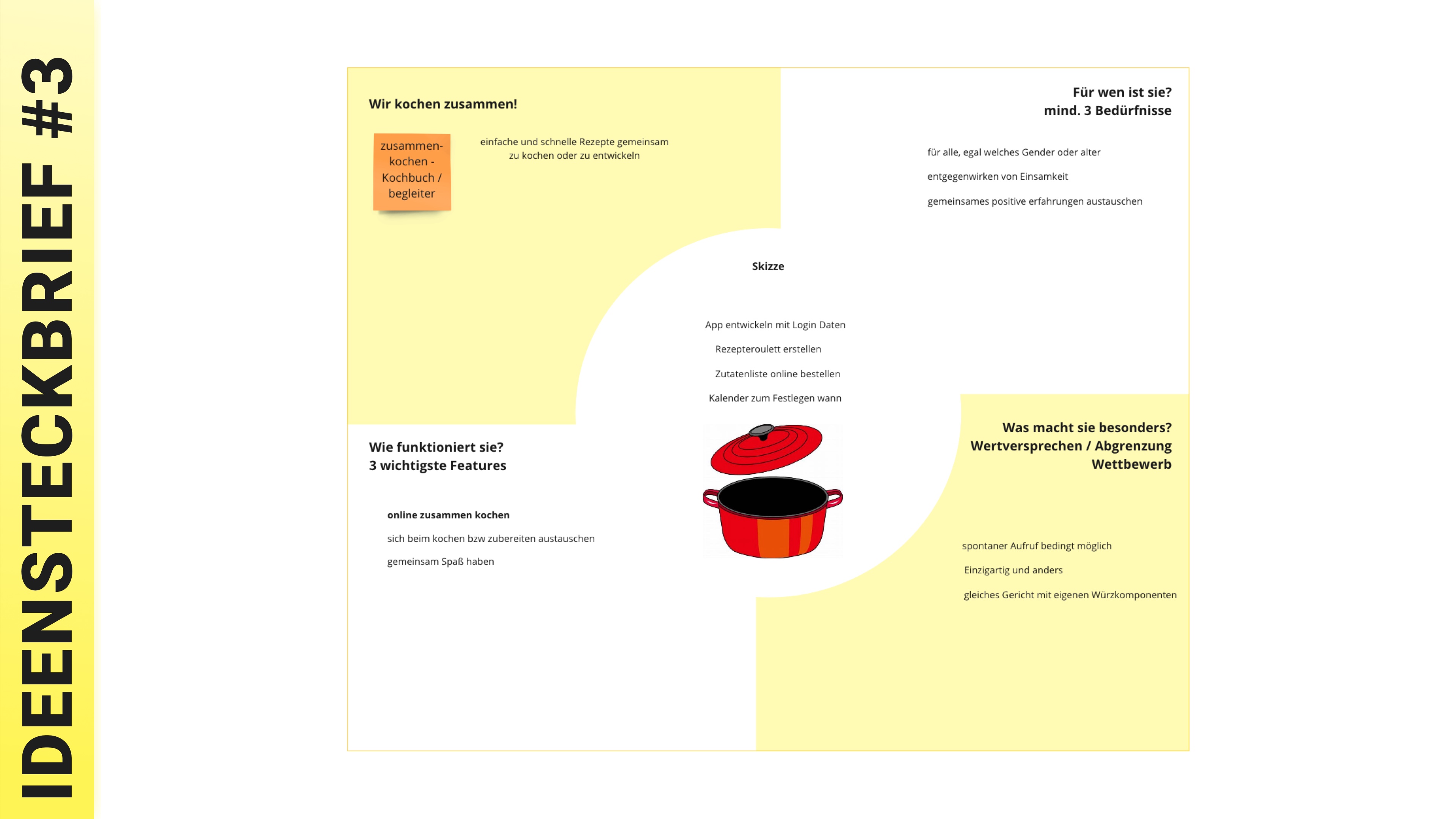
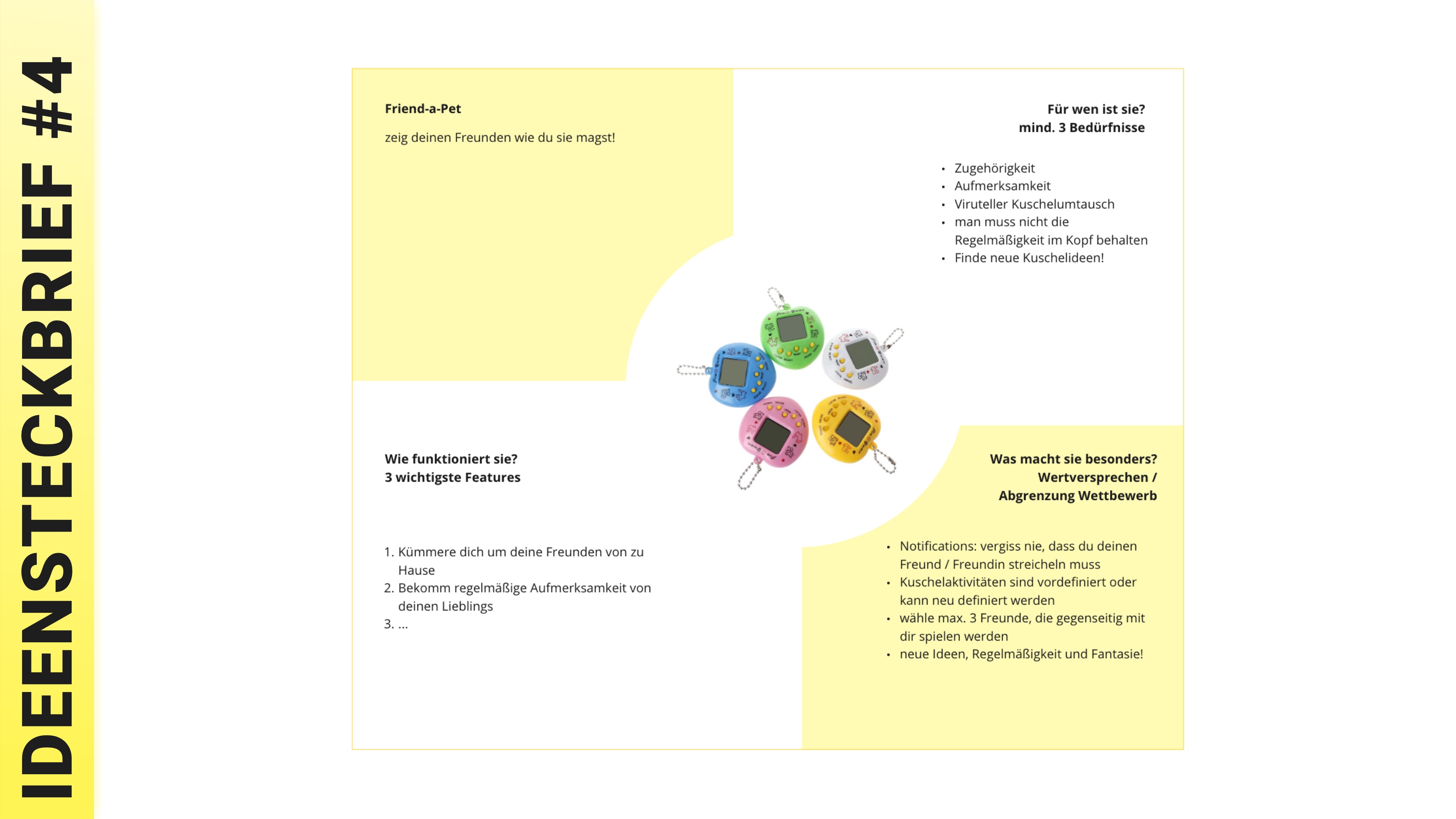
Although we almost agreed on a certain idea for further development, each of us took a product proposal and turned it into the "Idea letter".
At that point we had to describe the main challenge, 3 top features of the product, needs for which it is designed and some key options which make this product better than existing ones.
When all four product descriptions were prepared, we discussed their strengths and weaknesses and chose only one from them.
Doubtless, the winner was - "ChallengeBooster".
You can find all other product descriptions in images below.
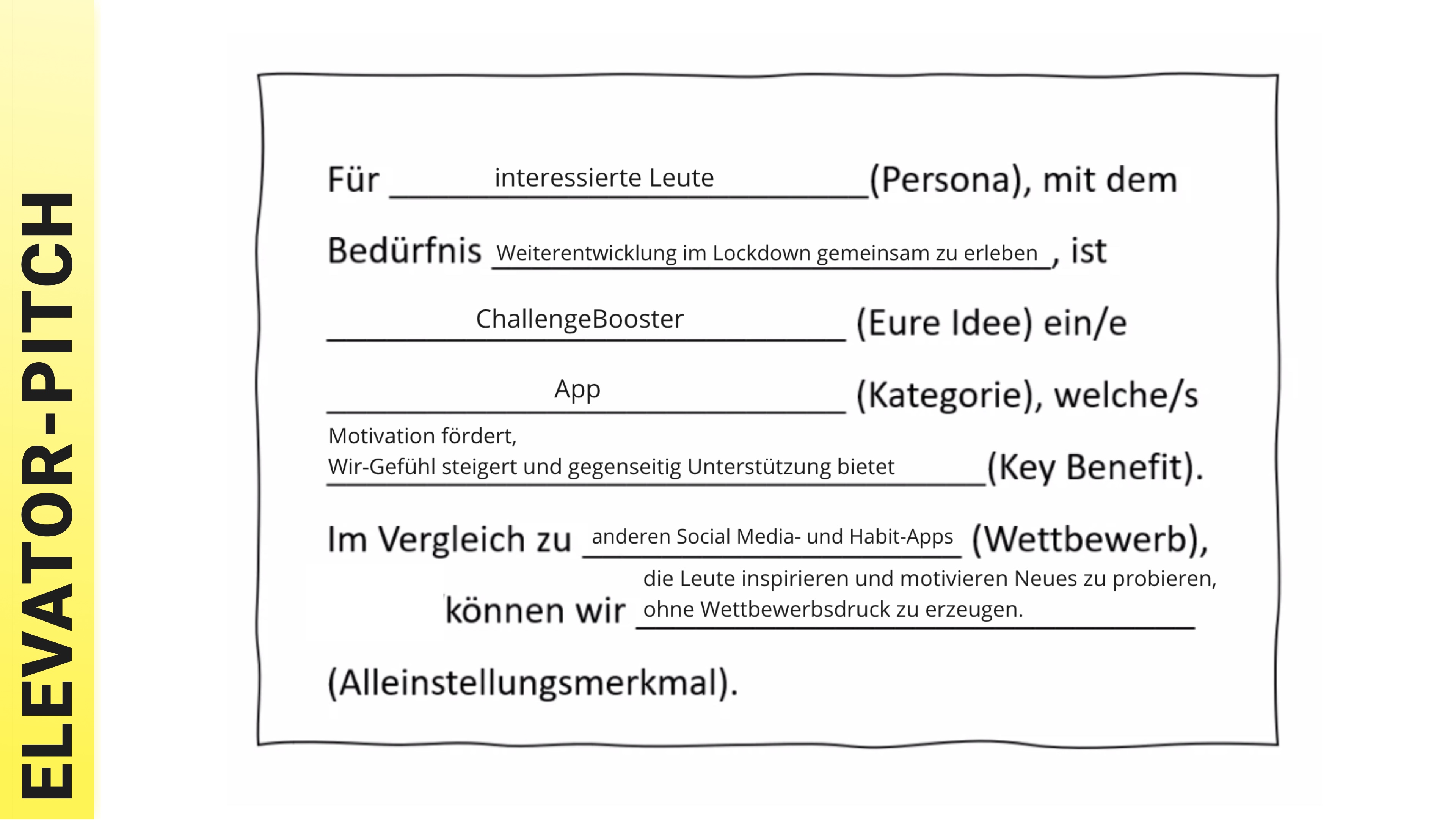
Elevator-Pitch
Each group in our course had to formulate an elevator speech and present it to others.
Its implementation was quite easy because we had a good understanding of what we wanted to build.
Moreover, our "HMW-Questions" provided us with good arguments why we should do this.
With this in mind and using our formulated personas we could define our unique selling proposition precisely and with a clear vision of where our product will be better than the existing solutions.
All those ideas were embodied in two sentences, which we presented.
You can build your own opinion about our concept while looking at images nearby.
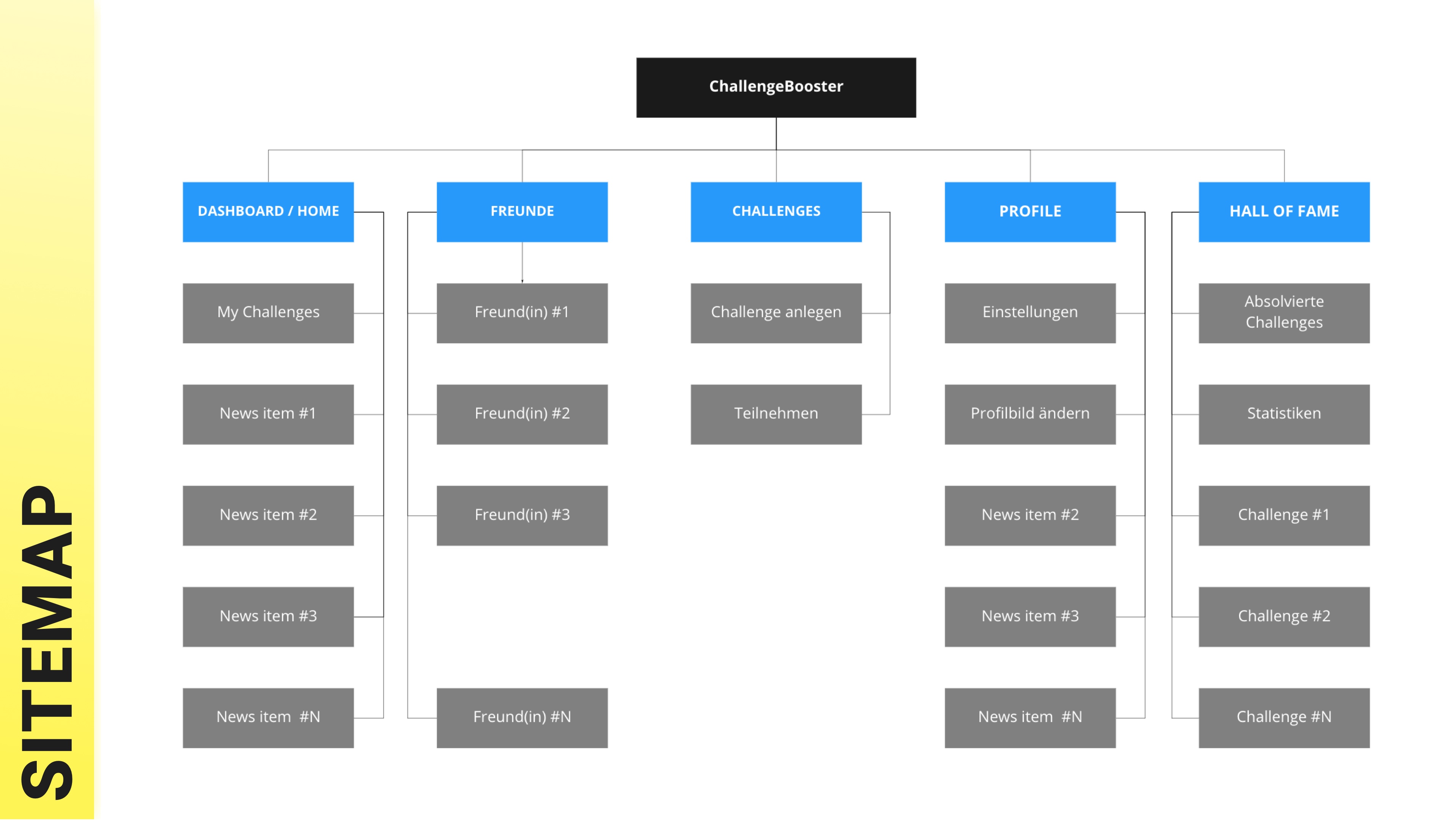
Sitemap / Card sorting
To make the App structure clearer and more user friendly, we used a card sorting method.
Indeed, we prepared cards that were (from our point of view) important for a user and used temporary names to identify them.
Also, we invited a real potential client for the App and with her help rebuilt the menu structure.
We also discussed what a user expects within each category and whether our naming corresponds to it.
We also went through basic user tasks in the App to get understanding whether other people know what and how to do to achieve user goals.
As a result, we formed a short sitemap for better understanding of the product.
You can check it in the image nearby.
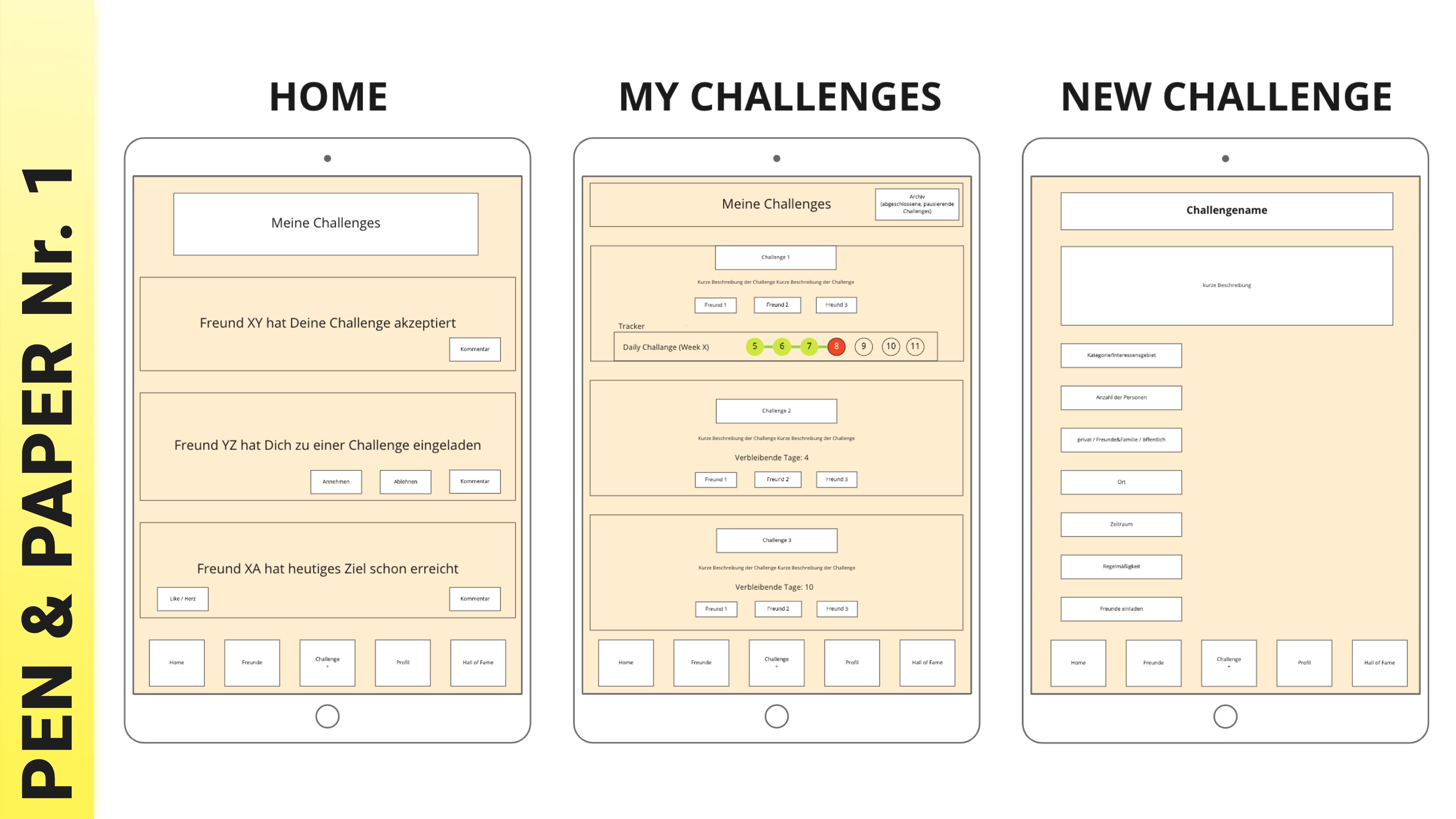
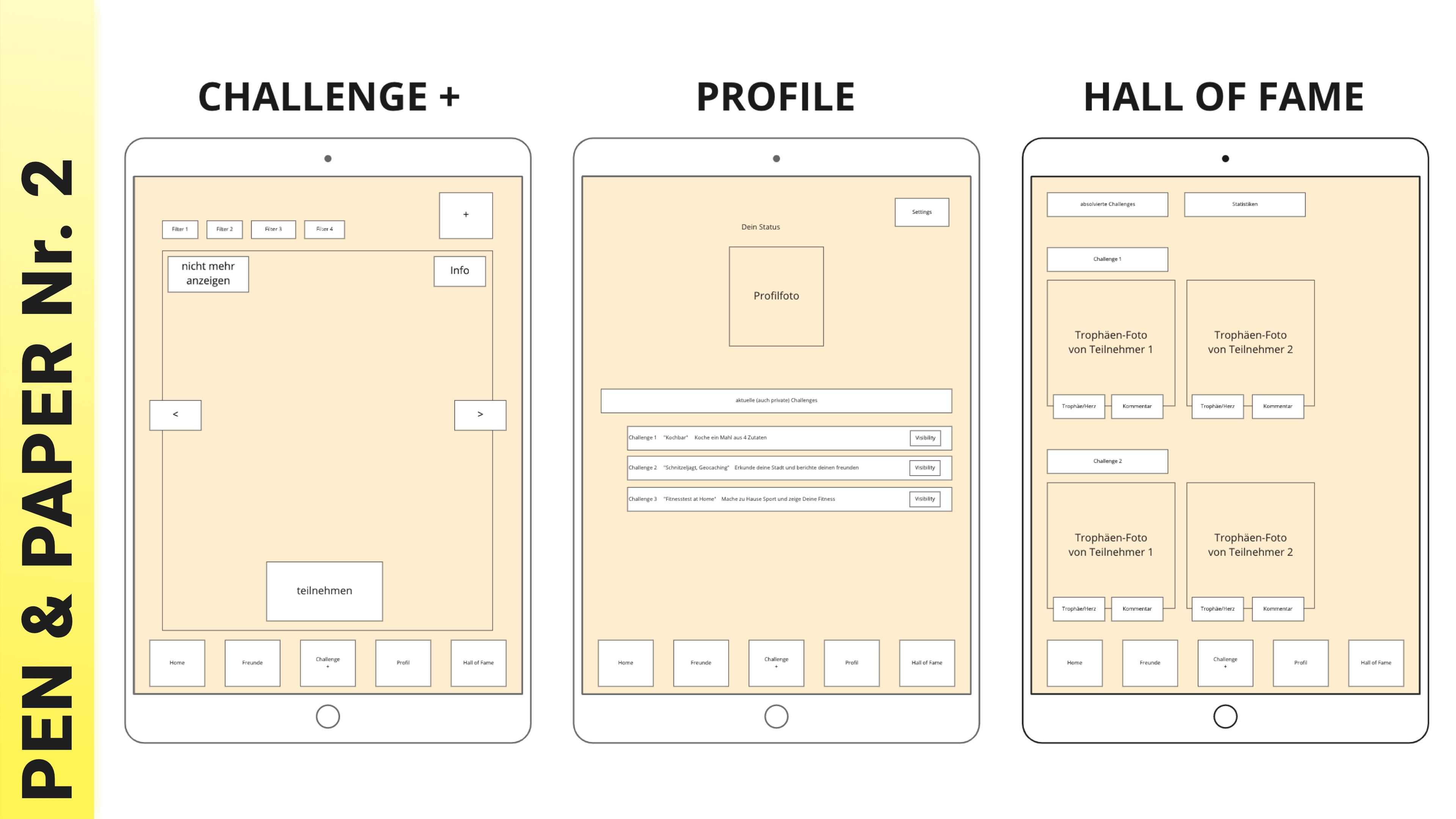
Pen & Paper prototype
Our goal was to make the majority of mistakes in the very early stage, when the cost of change is the lowest.
Thus, we started with a very famous "Pen & Paper" prototyping but with an even simpler digital implementation in Miro.
That is to say - no pen and no paper ;)
We found this way to be even faster and more practical than manipulations with analog (non-digital) materials.
Again, we used Miro to create a very, very rough graphical representation of the App and asked another real (potential) customer regarding the structure, naming and solving tasks within the software.
Quite rapidly we found that our naming strategy was a bit error-prone and evoked faulty expectations.
Also, the functionality representation was not always clear enough.
Customers did not find the "correct" / "valid" way to accomplish the task even being on the right page.
Of course, those rough prototype mistakes were corrected quickly, and the next short test showed us more satisfactory results.
At that point we have to admit that such a simple method being extrapolated on digital collaboration tools like Miro and supported by video conferencing software has an enormous potential for rapid software development and usability testing even in the early stages.
This means that we have flexibility within such aspects as change management, location, time, user control & understanding. And much more.
App screens ("prototype") we have used for the last testing are demonstrated on the two images below.
Moodboard
Every User Interface design process needs an excellent visual design to be more attractive to potential clients.
Consequently, creating a Moodboard is usually a part of the whole story.
In our case we consciously decided to focus on the product itself, its value, clear (menu / pp) structure and user's needs fulfillment.
Not surprisingly our Moodboards got not as much attention as they could and even probably should.
But still, they were prepared and you can find one of them in the closest picture.
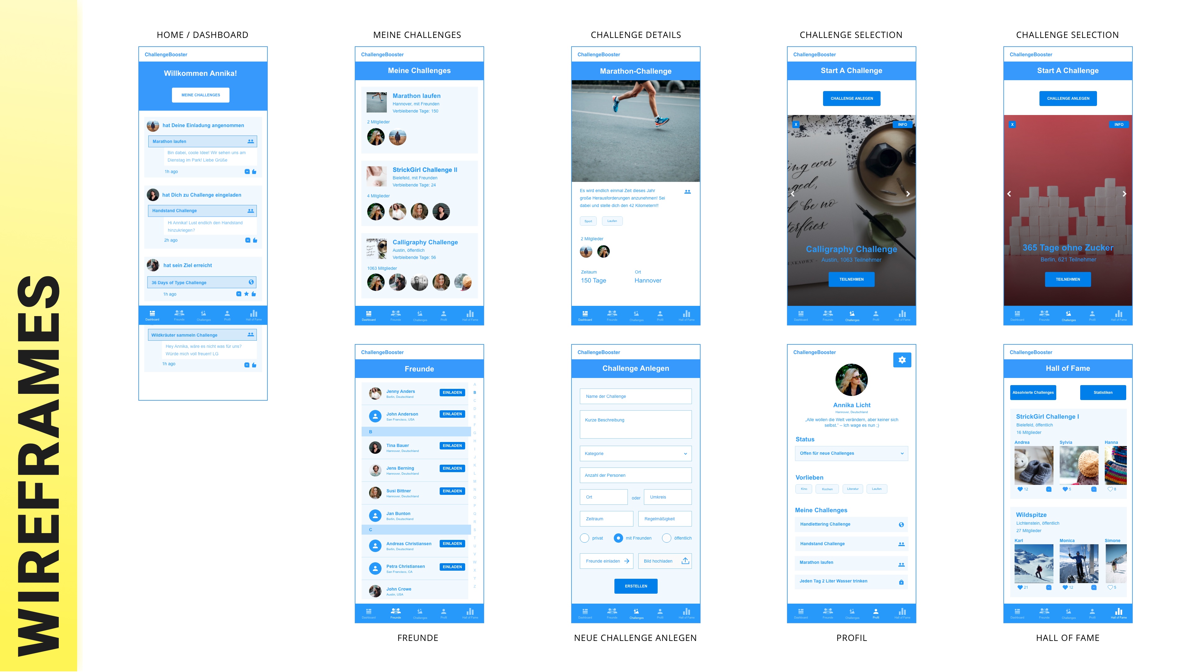
Adobe XD Wireframes
Actually, that part was one of the quickest.
We had a working solution, a selected Moodboard, basic understanding of what and how we want to build.
And we were four people with basic prototyping skills in Adobe XD.
Thus, we split up the work into small chunks between us and got things done fast.
Wireframes were ready.
You can build your own opinion regarding the results we got based on the image around.